Screenshot style breakdown
Sampled from 4 of ネオ・ストリーム:運命の終着点's App Store screenshots — background, accent and theme, measured by LaunchShots (not something Apple publishes).
#040404 bg
#272727
#745444 accent
#FFFFFF text
Screenshots
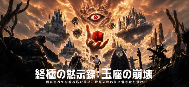
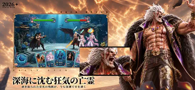
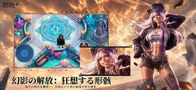
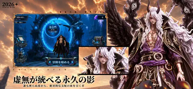
Icon palette
About this app
神秘な深海の世界へ足を踏み入れ、未知と挑戦に満ちた冒険を始めよう。 広大な海図を探索し、深海生物と出会い、戦略バトルで強敵を撃破し、新たな章とステージを解放せよ。 ダイヤモンドを集め、英雄を強化し、さらに深い海域へ挑み、海の奥に眠る秘密を解き明かせ。 ・多彩な章とステージ、段階的に進む冒険 ・簡単操作で戦略性豊かなリアルタイムバトル ・育成・強化可能な多種の英雄 ・美しい深海背景とキャラクターデザイン
App details
What you can learn from ネオ・ストリーム:運命の終着点
Every shipping app on the App Store has gone through the same decisions you're working through right now: which screenshot goes first, what caption sits over it, which device frame to show, what color the background should be. The 4 screenshots above are ネオ・ストリーム:運命の終着点's answers to those questions — they're public, they're real, and they made it through Apple's review.
What the numbers say: ネオ・ストリーム:運命の終着点 runs a dark set where the background shifts from screenshot to screenshot (first shot #040404) — each image has to stand on its own, so the captions carry more of the story. The accent colour we picked up, #745444, is the one to reuse for badges, arrows and highlighted words if you borrow this look. Hit Use this style to open the editor with these exact colours and drop your own screenshot in.
Notice the first screenshot in particular. It's the one users see in search results and on the product page, and it's where most apps spend their best caption and tightest design. Look at the proportion of background to phone, where the text sits, what one thing the image is trying to communicate.
Want to see how other Games apps approach the same problem? Browse more Games apps in the showcase.
Take what works into your own screenshots
Open LaunchShots and design your App Store & Google Play screenshots — pick a device frame, drop captions, ship in minutes. Free, in your browser.
Open the screenshot editor →Apps with a similar look
Closest background + accent colours among the listings we've analysed — useful when you want to see the same palette handled by a different team.