Chart position — tracked daily by LaunchShots
Screenshot style breakdown
Sampled from 3 of Aru's App Store screenshots — background, accent and theme, measured by LaunchShots (not something Apple publishes).
#FCFCFC bg
#DDDDDD
#4CAC64 accent
#111111 text
Screenshots
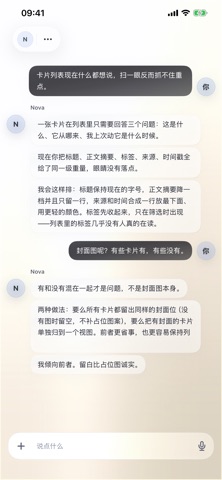
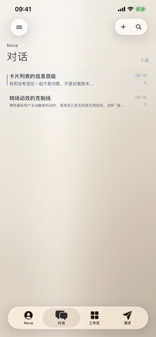
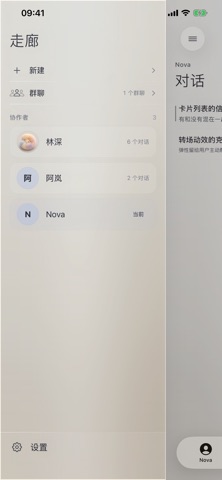
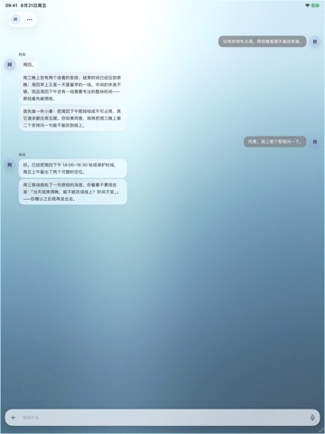
iPad screenshots


Icon palette
About this app
Aru 为你的日常想法和长期项目,留下一处可以持续整理的空间。 你可以选择自己的 AI 模型服务,创建熟悉的协作者,用对话记录灵感、整理资料、安排日常。不同的房间可以承载不同的话题与项目,记忆和资料也能为之后的交流提供参考。 在工作区里,把文档、图片、文件和小应用放到一起。你可以调整桌面小组件的大小和位置,让常用的内容更容易找到;也可以保存自己制作的小应用,随时回来继续使用。 如果你愿意,还可以启用日历、提醒事项,并连接 Apple 健康 App。Aru 可读取你授权的步数、活动、睡眠等信息,用于健康与健身摘要和日常安排;写入或删除健康记录前,需要你确认具体动作。这些功能用于日常健康管理与生活整理,不提供医疗诊断或治疗。 Aru 无需注册 Aru 账户。模型服务由你选择和配置,API Key 保存在系统钥匙串中;对话与作品保存在本机,并支持导出和备份。使用模型或外部连接服务时,请求所需的内容会发送至相应服务,具体处理方式可查看隐私政策。 遇到问题,或有希望我们改进的地方,欢迎到 Aru 信箱告诉我们:https://feedback.aelion.cn/
App details
What you can learn from Aru
Every shipping app on the App Store has gone through the same decisions you're working through right now: which screenshot goes first, what caption sits over it, which device frame to show, what color the background should be. The 6 screenshots above are Aru's answers to those questions — they're public, they're real, and they made it through Apple's review.
What the numbers say: Aru runs a light set where the background shifts from screenshot to screenshot (first shot #FCFCFC) — each image has to stand on its own, so the captions carry more of the story. The accent colour we picked up, #4CAC64, is the one to reuse for badges, arrows and highlighted words if you borrow this look. Hit Use this style to open the editor with these exact colours and drop your own screenshot in.
Notice the first screenshot in particular. It's the one users see in search results and on the product page, and it's where most apps spend their best caption and tightest design. Look at the proportion of background to phone, where the text sits, what one thing the image is trying to communicate.
Want to see how other Productivity apps approach the same problem? Browse more Productivity apps in the showcase.
Take what works into your own screenshots
Open LaunchShots and design your App Store & Google Play screenshots — pick a device frame, drop captions, ship in minutes. Free, in your browser.
Open the screenshot editor →Apps with a similar look
Closest background + accent colours among the listings we've analysed — useful when you want to see the same palette handled by a different team.