Screenshot style breakdown
Sampled from 6 of Odyseusz's App Store screenshots — background, accent and theme, measured by LaunchShots (not something Apple publishes).
#FCFCFC bg
#DDDDDD
#0454A4 accent
#111111 text
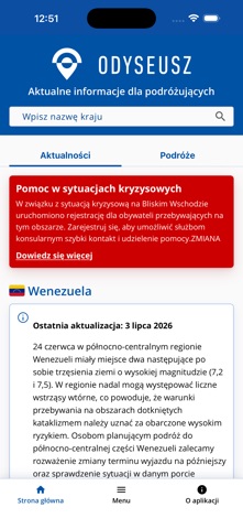
- #1Aktualne informacje dla podróżujących
- #24 Aby zgłosić podróż lub zarządzać swoimi zgłoszeniami, uwierzytelnij się za pomocą login.
- #312:52 I < Wstecz Informacje o podróży
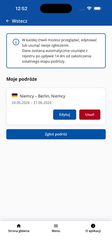
- #412:52 I < Wstecz ® W kazdej chwili możesz przeglądać, edytować
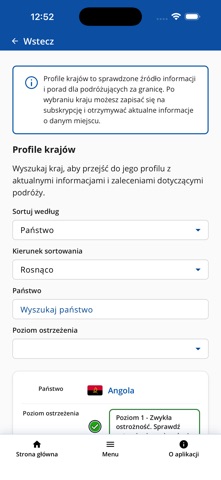
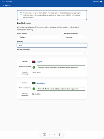
- #512:52 I < Wstecz ® Profile krajów to sprawdzone źródło informacji
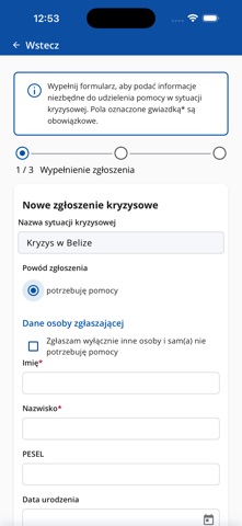
- #612:53 I < Wstecz ® Wypełnij formularz, aby podać informacje
Captions read from the screenshots (OCR, may contain small errors): 6 headlines, 9.3 words on average (longest 13).
Screenshots


iPad screenshots




Icon palette
About this app
Odyseusz to oficjalna aplikacja Ministerstwa Spraw Zagranicznych, która wspiera Polki i Polaków podróżujących za granicę. Dzięki niej możesz łatwo zaplanować wyjazd, zarejestrować swoją podróż, śledzić aktualne informacje dotyczące bezpieczeństwa oraz otrzymywać ważne komunikaty związane z krajem lub regionem, w którym przebywasz. Aplikacja została stworzona z myślą o osobach podróżujących turystycznie, służbowo, edukacyjnie oraz prywatnie. Odyseusz zapewnia szybki dostęp do najważniejszych informacji publikowanych przez Ministerstwo Spraw Zagranicznych oraz ułatwia kontakt ze służbą konsularną w sytuacjach wymagających pomocy. Najważniejsze funkcje: - Rejestracja podróży zagranicznych w prosty i wygodny sposób. - Dostęp do aktualnych informacji o państwach i terytoriach świata, w tym warunków wjazdu, pobytu oraz poziomu bezpieczeństwa. - Powiadomienia PUSH o zmianach sytuacji bezpiecz…
App details
What you can learn from Odyseusz
Every shipping app on the App Store has gone through the same decisions you're working through right now: which screenshot goes first, what caption sits over it, which device frame to show, what color the background should be. The 11 screenshots above are Odyseusz's answers to those questions — they're public, they're real, and they made it through Apple's review.
What the numbers say: Odyseusz runs a light set with one background colour (#FCFCFC) carried across every screenshot — the listing reads as a single poster when the shots sit side by side in search results. The accent colour we picked up, #0454A4, is the one to reuse for badges, arrows and highlighted words if you borrow this look. Hit Use this style to open the editor with these exact colours and drop your own screenshot in.
Notice the first screenshot in particular. It's the one users see in search results and on the product page, and it's where most apps spend their best caption and tightest design. Look at the proportion of background to phone, where the text sits, what one thing the image is trying to communicate.
Want to see how other Travel apps approach the same problem? Browse more Travel apps in the showcase.
Take what works into your own screenshots
Open LaunchShots and design your App Store & Google Play screenshots — pick a device frame, drop captions, ship in minutes. Free, in your browser.
Open the screenshot editor →Apps with a similar look
Closest background + accent colours among the listings we've analysed — useful when you want to see the same palette handled by a different team.