Chart position — tracked daily by LaunchShots
Screenshot style breakdown
Sampled from 6 of スチームパンク:クロノ要塞's App Store screenshots — background, accent and theme, measured by LaunchShots (not something Apple publishes).
#64BCEC bg
#58A5CF
#6C543C accent
#111111 text
Screenshots

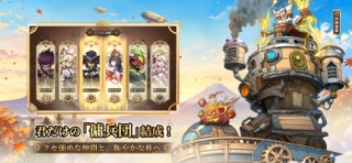
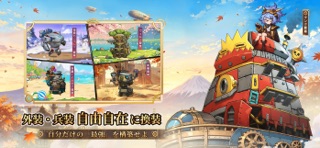

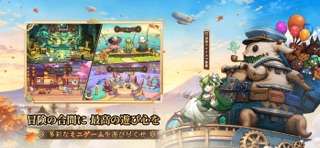

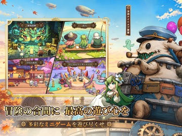
iPad screenshots



Icon palette
About this app
源質の暴動、時空を超えた冒険へ―― 蒸気パンク末世に蠢く怪獣軍団。 個性豊かな英雄たちと共に、移動要塞で文明最後の砦を守れ! 指揮官よ、廃土大陸で機動作戦を展開せよ―― ▼ 英雄召喚で伝説の仲間を集結 ▼ 機甲強化で最強要塞を構築 ▼ リアルタイム対戦で他指揮官と激突! アプリ概要 終末世界×英雄育成×放置RPG×機甲要塞――運命を賭けた大冒険が始まる! ▼ サービス記念!無料10,000ガチャ&伝説級要塞フォルム進呈 ▼ ログインで超回復ヒーロー「暁の聖女」 即時解放! =ゲーム特長= 【革新プレイ:移動防衛×要塞戦略】 ・要塞を改造しメカニックユニットを編成――突撃・包囲・奇襲が自由自在 ・英雄スキル連携で戦局を制す:聖女の癒し/砲撃手の火力支援/忍者の奇襲 【多元成長システム:育成と収集】 ◆ 放置育成:オフライン中も資源自動獲得!英雄レベル・機甲パーツを効率強化 ◆ 秘境探検:廃土の奥地で伝説素材や装備を発掘し実力を高めよう ◆ コレクション図鑑:100体以上のキャラを収集!専用スキンで個性を演出 【白熱の対戦:戦略が勝敗を分け…
App details
What you can learn from スチームパンク:クロノ要塞
Every shipping app on the App Store has gone through the same decisions you're working through right now: which screenshot goes first, what caption sits over it, which device frame to show, what color the background should be. The 12 screenshots above are スチームパンク:クロノ要塞's answers to those questions — they're public, they're real, and they made it through Apple's review.
What the numbers say: スチームパンク:クロノ要塞 runs a light set where the background shifts from screenshot to screenshot (first shot #64BCEC) — each image has to stand on its own, so the captions carry more of the story. The accent colour we picked up, #6C543C, is the one to reuse for badges, arrows and highlighted words if you borrow this look. Hit Use this style to open the editor with these exact colours and drop your own screenshot in.
Notice the first screenshot in particular. It's the one users see in search results and on the product page, and it's where most apps spend their best caption and tightest design. Look at the proportion of background to phone, where the text sits, what one thing the image is trying to communicate.
Want to see how other Games apps approach the same problem? Browse more Games apps in the showcase.
Take what works into your own screenshots
Open LaunchShots and design your App Store & Google Play screenshots — pick a device frame, drop captions, ship in minutes. Free, in your browser.
Open the screenshot editor →Apps with a similar look
Closest background + accent colours among the listings we've analysed — useful when you want to see the same palette handled by a different team.