Chart position — tracked daily by LaunchShots
Screenshot style breakdown
Sampled from 6 of パララボ - 攻略AIツール's App Store screenshots — background, accent and theme, measured by LaunchShots (not something Apple publishes).
#F45C94 bg
#F572A2
#4C348C accent
#FFFFFF text
Screenshots


Icon palette
About this app
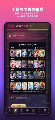
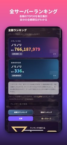
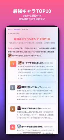
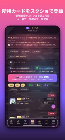
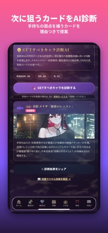
パラノイズ(PARANOIZE)の攻略に必要なものを、この1本に。全サーバー上位のプレイヤーが毎日更新している、非公式の攻略・データベースアプリです。 ■ できること ・最強キャラTier表:全SSRを5段階で評価。新カードは実装当日に追記 ・編成AI:所持カードを登録するだけで、最強編成と配置順を提案 ・秘石AI/育成方針AI/相性チェック:迷いがちな強化の優先度を即答 ・GETすべきキャラ診断AI/麗華の野望AI/闘技場AI:いま何を狙うべきかを手持ちから判断 ・パラノイズ王(全サーバーランキング):全サーバーのTOP30を毎日集計。自分の全サーバー順位・前日比・成長記録が見られます ・所持カード管理:部隊編成のスクショを選ぶだけで、所持・Lv・戦力・覚醒をまとめて登録 ・図鑑:スキル全文・ガチャ演出のセリフ・ホームボイスをキャラ別に ・攻略Wiki:序盤の進め方、ダイヤの集め方、麗華の野望、更新スケジュール、遺跡の階層属性まで ■ プッシュ通知 毎朝の全サーバーTOP10、新サーバー情報、コロシアム・レイドの終了前、鉱山リセット前、野望・統…
App details
What you can learn from パララボ - 攻略AIツール
Every shipping app on the App Store has gone through the same decisions you're working through right now: which screenshot goes first, what caption sits over it, which device frame to show, what color the background should be. The 8 screenshots above are パララボ - 攻略AIツール's answers to those questions — they're public, they're real, and they made it through Apple's review.
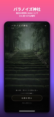
What the numbers say: パララボ - 攻略AIツール runs a dark set with one background colour (#F45C94) carried across every screenshot — the listing reads as a single poster when the shots sit side by side in search results. The accent colour we picked up, #4C348C, is the one to reuse for badges, arrows and highlighted words if you borrow this look. Hit Use this style to open the editor with these exact colours and drop your own screenshot in.
Notice the first screenshot in particular. It's the one users see in search results and on the product page, and it's where most apps spend their best caption and tightest design. Look at the proportion of background to phone, where the text sits, what one thing the image is trying to communicate.
Want to see how other Reference apps approach the same problem? Browse more Reference apps in the showcase.
Take what works into your own screenshots
Open LaunchShots and design your App Store & Google Play screenshots — pick a device frame, drop captions, ship in minutes. Free, in your browser.
Open the screenshot editor →Apps with a similar look
Closest background + accent colours among the listings we've analysed — useful when you want to see the same palette handled by a different team.