Chart position — tracked daily by LaunchShots
Screenshot style breakdown
Sampled from 6 of 伯吉的温馨厨房's App Store screenshots — background, accent and theme, measured by LaunchShots (not something Apple publishes).
#049474 bg
#27A287
#B45C44 accent
#FFFFFF text
Screenshots
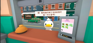
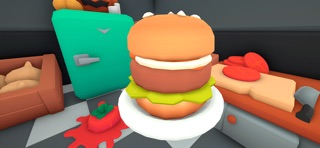
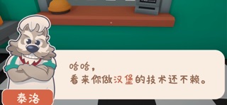
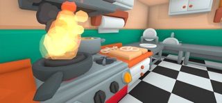

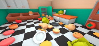
iPad screenshots


Icon palette
About this app
《伯吉的温馨厨房》是一款从Steam平台移植的治愈系模拟经营游戏,主打轻松真实'无压力'的烹饪体验与可爱又混乱的物理互动效果,让你随时随地都能打理属于自己的温馨小店! 核心玩法 1.完整汉堡制作流程:从清洗食材、切配蔬菜、煎制肉饼到组合配料,每一步都还原真实厨房操作,亲手打造顾客们喜爱的美味汉堡 2.多模式自由切换: 。放松模式:每 5-15 分钟服务一次顾客,适合碎片化时间,可后台挂机,订单响铃提醒,摸鱼必备 。番茄钟模式:游戏化专注工具,设置计时器,休息时间自动提醒,工作娱乐两不误 。极速模式:挑战手速极限,体验忙中有序的烹饪乐趣 3.店铺升级系统:用赚取的金币解锁新食材、厨具和店铺装饰,打造独属于自己的小店 4.订单管理:通过平板订购食材,满足动物顾客们千奇百怪的汉堡需求,获得好评与奖励 游戏特色 。Steam移植:保留 PC 版核心内容,针对手机端优化操作界面,可轻松游玩,随时随地享受烹饪乐趣 。治愈系卡通画风:3D 软萌动物形象与色彩明快的场景,搭配轻松背景音乐,瞬间治愈疲惫心情 。真实游戏体验:全程无限时压榨、无…
App details
What you can learn from 伯吉的温馨厨房
Every shipping app on the App Store has gone through the same decisions you're working through right now: which screenshot goes first, what caption sits over it, which device frame to show, what color the background should be. The 11 screenshots above are 伯吉的温馨厨房's answers to those questions — they're public, they're real, and they made it through Apple's review.
What the numbers say: 伯吉的温馨厨房 runs a mixed light-and-dark set where the background shifts from screenshot to screenshot (first shot #049474) — each image has to stand on its own, so the captions carry more of the story. The accent colour we picked up, #B45C44, is the one to reuse for badges, arrows and highlighted words if you borrow this look. Hit Use this style to open the editor with these exact colours and drop your own screenshot in.
Notice the first screenshot in particular. It's the one users see in search results and on the product page, and it's where most apps spend their best caption and tightest design. Look at the proportion of background to phone, where the text sits, what one thing the image is trying to communicate.
Want to see how other Games apps approach the same problem? Browse more Games apps in the showcase.
Take what works into your own screenshots
Open LaunchShots and design your App Store & Google Play screenshots — pick a device frame, drop captions, ship in minutes. Free, in your browser.
Open the screenshot editor →Apps with a similar look
Closest background + accent colours among the listings we've analysed — useful when you want to see the same palette handled by a different team.