Chart position — tracked daily by LaunchShots
Screenshot style breakdown
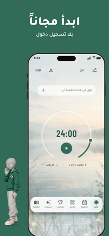
Sampled from 6 of نية: مؤقت بومودورو للتركيز's App Store screenshots — background, accent and theme, measured by LaunchShots (not something Apple publishes).
#346C5C bg
#508072
#CCCC84 accent
#FFFFFF text
Screenshots


iPad screenshots


Icon palette
About this app
حوّل ما تنوي إنجازه إلى جلسة تركيز واضحة، ثم شاهد أين ذهب وقتك. «نية» مؤقت بومودورو عربي هادئ للدراسة والعمل. اكتب نيتك أولاً لتبقى المهمة أمامك طوال الجلسة، ثم اختر نمط التركيز الذي يلائم وقتك وطاقتك. ومعك نون، رفيق يشجّعك ويساعدك على المذاكرة. كل ما تحتاجه لتبدأ وتواصل: • نون رفيقك في التركيز: حادثه بصوتك أو بالكتابة، يشجّعك أثناء الجلسة، ويشرح لك التطبيق خطوة بخطوة. • «بطاقات» للمذاكرة: أنشئ بطاقاتك وراجعها في الوقت المناسب، أو دع نون يجهّزها لك من ملف PDF أو رابط يوتيوب، وسمّع إجاباتك بصوتك. • احمِ جلستك: اقفل التطبيقات التي تشتتك أثناء التركيز فقط. • مؤقت هادئ وواضح بأنماط جاهزة أو مدد تخصّصها بنفسك. • تمارين «استعداد» قصيرة تهيّئ ذهنك قبل الجلسة، وتمارين تنفّس للعودة بصفاء. • أصوات طبيعية تمزجها كما تحب، وإذاعات القرآن الكريم. • نوايا متكررة وعادات تتابع تقدّمك فيها. • إحصاءات وتصنيفات توضّح أين استثمرت وقتك. • سجّل دخولك لتبقى بياناتك ومشترياتك معك على أجهزتك. لا تنتظ…
App details
What you can learn from نية: مؤقت بومودورو للتركيز
Every shipping app on the App Store has gone through the same decisions you're working through right now: which screenshot goes first, what caption sits over it, which device frame to show, what color the background should be. The 16 screenshots above are نية: مؤقت بومودورو للتركيز's answers to those questions — they're public, they're real, and they made it through Apple's review.
What the numbers say: نية: مؤقت بومودورو للتركيز runs a dark set with one background colour (#346C5C) carried across every screenshot — the listing reads as a single poster when the shots sit side by side in search results. The accent colour we picked up, #CCCC84, is the one to reuse for badges, arrows and highlighted words if you borrow this look. Hit Use this style to open the editor with these exact colours and drop your own screenshot in.
Notice the first screenshot in particular. It's the one users see in search results and on the product page, and it's where most apps spend their best caption and tightest design. Look at the proportion of background to phone, where the text sits, what one thing the image is trying to communicate.
Want to see how other Productivity apps approach the same problem? Browse more Productivity apps in the showcase.
Take what works into your own screenshots
Open LaunchShots and design your App Store & Google Play screenshots — pick a device frame, drop captions, ship in minutes. Free, in your browser.
Open the screenshot editor →Apps with a similar look
Closest background + accent colours among the listings we've analysed — useful when you want to see the same palette handled by a different team.