Chart position — tracked daily by LaunchShots
Screenshot style breakdown
Sampled from 5 of 提弓调试's App Store screenshots — background, accent and theme, measured by LaunchShots (not something Apple publishes).
#0C0C0C bg
#2E2E2E
#6C2C2C accent
#FFFFFF text
Screenshots


Icon palette
About this app
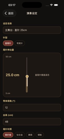
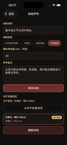
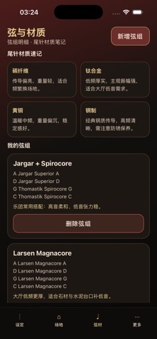
提弓调试面向职业与学院大提琴演奏者,帮助你在换音乐厅、排练厅或尾针形态时,快速留下可复盘的演奏设定。 你可以把尾针伸出厘米数、琴体倾角、坐高、直针或弯尾针、尾针材质、防滑锚点,与实木悬空、大理石、地毯、水泥等地板类型关联起来,并记下 C/G 弦主观振幅与姿势感受。 核心能力: - 新建与管理演奏设定,支持直/弯针与针轨式伸出量记录 - 场地声学日志,按地板材质保存反射与建议伸出量 - 弦组 A/D/G/C 明细,并挂到具体设定 - 共鸣打卡、本厅首选标记,以及两条设定的几何对比 - 演示数据增删,便于完整走查核心旅程 适合在排练间隙快速录入,并在下次上场前按场地筛选召回。
App details
What you can learn from 提弓调试
Every shipping app on the App Store has gone through the same decisions you're working through right now: which screenshot goes first, what caption sits over it, which device frame to show, what color the background should be. The 5 screenshots above are 提弓调试's answers to those questions — they're public, they're real, and they made it through Apple's review.
What the numbers say: 提弓调试 runs a dark set with one background colour (#0C0C0C) carried across every screenshot — the listing reads as a single poster when the shots sit side by side in search results. The accent colour we picked up, #6C2C2C, is the one to reuse for badges, arrows and highlighted words if you borrow this look. Hit Use this style to open the editor with these exact colours and drop your own screenshot in.
Notice the first screenshot in particular. It's the one users see in search results and on the product page, and it's where most apps spend their best caption and tightest design. Look at the proportion of background to phone, where the text sits, what one thing the image is trying to communicate.
Want to see how other Music apps approach the same problem? Browse more Music apps in the showcase.
Take what works into your own screenshots
Open LaunchShots and design your App Store & Google Play screenshots — pick a device frame, drop captions, ship in minutes. Free, in your browser.
Open the screenshot editor →Apps with a similar look
Closest background + accent colours among the listings we've analysed — useful when you want to see the same palette handled by a different team.