Chart position — tracked daily by LaunchShots
Screenshot style breakdown
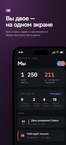
Sampled from 6 of You&Me's App Store screenshots — background, accent and theme, measured by LaunchShots (not something Apple publishes).
#1C1C1C bg
#3B3B3B
#E4746C accent
#FFFFFF text
Screenshots


iPad screenshots


Icon palette
About this app
You&Me — календарь, списки и общие планы для двоих Запланировать выходные, не забыть важную дату и решить, что купить по дороге домой. В You&Me у вас с партнёром есть общее место для повседневных дел и планов. - Календарь и напоминания. Добавляйте встречи, поездки и важные даты. Смотрите, что впереди, в обзоре, на месяц или на неделю по часам. - Задачи и списки. Собирайте покупки, делите дела и отмечайте сделанное. Если планы поменялись, отредактируйте пункт прямо в списке. - Хотелки. Сохраняйте идеи подарков и вещи, которые хочется купить. Добавляйте фото и ссылки, чтобы партнёр знал, что вы имели в виду. - Чат, вопросы и игры. Обсуждайте планы, голосуйте за варианты, отвечайте на вопрос дня или сыграйте партию вместе. - Капсулы времени. Напишите друг другу письма и выберите день, когда их можно будет открыть. - Виджеты. Вынесите на главный экран ближайшие события, задачи, заметки или…
App details
What you can learn from You&Me
Every shipping app on the App Store has gone through the same decisions you're working through right now: which screenshot goes first, what caption sits over it, which device frame to show, what color the background should be. The 15 screenshots above are You&Me's answers to those questions — they're public, they're real, and they made it through Apple's review.
What the numbers say: You&Me runs a mixed light-and-dark set where the background shifts from screenshot to screenshot (first shot #1C1C1C) — each image has to stand on its own, so the captions carry more of the story. The accent colour we picked up, #E4746C, is the one to reuse for badges, arrows and highlighted words if you borrow this look. Hit Use this style to open the editor with these exact colours and drop your own screenshot in.
Notice the first screenshot in particular. It's the one users see in search results and on the product page, and it's where most apps spend their best caption and tightest design. Look at the proportion of background to phone, where the text sits, what one thing the image is trying to communicate.
Want to see how other Lifestyle apps approach the same problem? Browse more Lifestyle apps in the showcase.
Take what works into your own screenshots
Open LaunchShots and design your App Store & Google Play screenshots — pick a device frame, drop captions, ship in minutes. Free, in your browser.
Open the screenshot editor →Apps with a similar look
Closest background + accent colours among the listings we've analysed — useful when you want to see the same palette handled by a different team.