Chart position — tracked daily by LaunchShots
Screenshot style breakdown
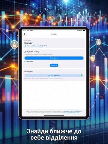
Sampled from 3 of Черга ID's App Store screenshots — background, accent and theme, measured by LaunchShots (not something Apple publishes).
#0C1434 bg
#2E3450
#144C84 accent
#FFFFFF text
Screenshots
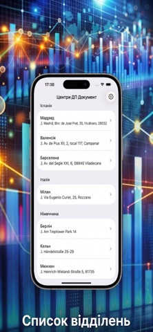
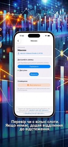
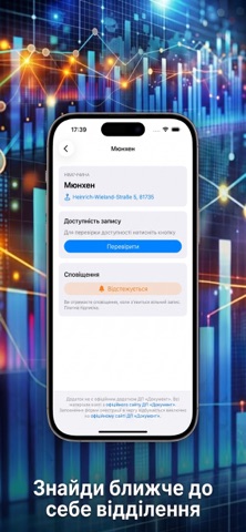
iPad screenshots

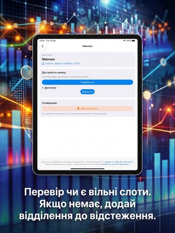
Icon palette
About this app
Забудьте про постійне оновлення сторінок — записуйтесь у ДП «Документ» легко та без зайвого стресу! Зручний помічник для українців за кордоном, який допомагає миттєво дізнатися про наявність вільних місць в електронній черзі до закордонних філій ДП «Документ». Головні можливості: • Повний каталог центрів: Переглядайте повний список відділень ДП «Документ» з інтерактивною картою та точними адресами розташування. • Перевірка слотів в один клік: Актуальний стан черги у закордонних філіях у реальному часі. • Автоматичне відстеження: Немає вільних місць? Увімкніть фонове відстеження для потрібного закордонного відділення та отримуйте сповіщення, як тільки з'явиться новий слот. • Швидкий перехід до запису: Коли з'являються вільні місця, додаток дозволяє миттєво перейти до бронювання. Заощаджуйте свій час та отримуйте документи вчасно! Важлива примітка (Disclaimer): Цей додаток не є офіцій…
App details
What you can learn from Черга ID
Every shipping app on the App Store has gone through the same decisions you're working through right now: which screenshot goes first, what caption sits over it, which device frame to show, what color the background should be. The 6 screenshots above are Черга ID's answers to those questions — they're public, they're real, and they made it through Apple's review.
What the numbers say: Черга ID runs a dark set with one background colour (#0C1434) carried across every screenshot — the listing reads as a single poster when the shots sit side by side in search results. The accent colour we picked up, #144C84, is the one to reuse for badges, arrows and highlighted words if you borrow this look. Hit Use this style to open the editor with these exact colours and drop your own screenshot in.
Notice the first screenshot in particular. It's the one users see in search results and on the product page, and it's where most apps spend their best caption and tightest design. Look at the proportion of background to phone, where the text sits, what one thing the image is trying to communicate.
Want to see how other News apps approach the same problem? Browse more News apps in the showcase.
Take what works into your own screenshots
Open LaunchShots and design your App Store & Google Play screenshots — pick a device frame, drop captions, ship in minutes. Free, in your browser.
Open the screenshot editor →Apps with a similar look
Closest background + accent colours among the listings we've analysed — useful when you want to see the same palette handled by a different team.