Chart position — tracked daily by LaunchShots
Screenshot style breakdown
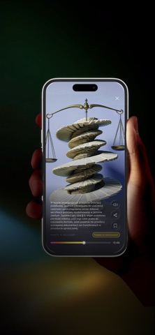
Sampled from 6 of EY Now's App Store screenshots — background, accent and theme, measured by LaunchShots (not something Apple publishes).
#040404 bg
#272727
#6C1414 accent
#FFFFFF text
Reading the caption text from the screenshots in your browser…
Screenshots

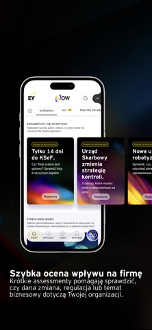
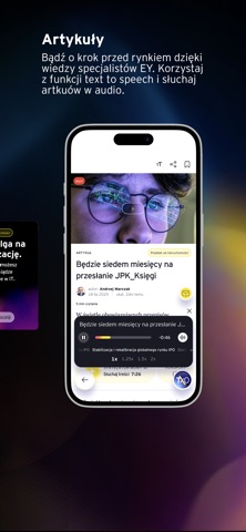
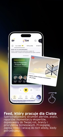

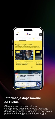

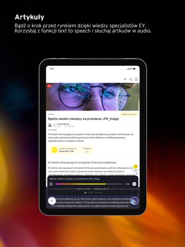
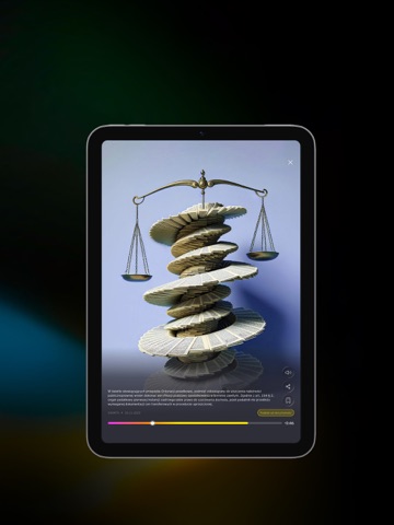
iPad screenshots




Icon palette
About this app
EY Now Nie chodzi o więcej informacji. Chodzi o właściwe. EY Now to inteligentne centrum wiedzy biznesowej stworzone przez EY. Aplikacja analizuje tysiące źródeł i wybiera te informacje, które mogą mieć realny wpływ na Twoją firmę. Wie, czego potrzebujesz, rozumie kontekst Twojego biznesu, zna odpowiedzi na pytania, których jeszcze nawet nie zdążyłeś zadać, i pozwala szybciej dostrzec to, co naprawdę wymaga uwagi. To nie jest kolejne źródło informacji. To osobisty asystent biznesowy, który pomaga zrozumieć, co dzieje się wokół Twojej firmy i jak na to reagować. Zamiast poświęcać czas na monitorowanie zmian i wyszukiwanie informacji, zyskujesz gotowe analizy, alerty, komentarze ekspertów oraz praktyczne wskazówki wspierające podejmowanie decyzji. Dlaczego EY Now? Informacje dopasowane do Ciebie Otrzymujesz tylko te treści, które są istotne dla Twojej firmy, branży i aktualnych wyzw…
App details
What you can learn from EY Now
Every shipping app on the App Store has gone through the same decisions you're working through right now: which screenshot goes first, what caption sits over it, which device frame to show, what color the background should be. The 16 screenshots above are EY Now's answers to those questions — they're public, they're real, and they made it through Apple's review.
What the numbers say: EY Now runs a dark set with one background colour (#040404) carried across every screenshot — the listing reads as a single poster when the shots sit side by side in search results. The accent colour we picked up, #6C1414, is the one to reuse for badges, arrows and highlighted words if you borrow this look. Hit Use this style to open the editor with these exact colours and drop your own screenshot in.
Notice the first screenshot in particular. It's the one users see in search results and on the product page, and it's where most apps spend their best caption and tightest design. Look at the proportion of background to phone, where the text sits, what one thing the image is trying to communicate.
Want to see how other News apps approach the same problem? Browse more News apps in the showcase.
Take what works into your own screenshots
Open LaunchShots and design your App Store & Google Play screenshots — pick a device frame, drop captions, ship in minutes. Free, in your browser.
Open the screenshot editor →Apps with a similar look
Closest background + accent colours among the listings we've analysed — useful when you want to see the same palette handled by a different team.