Chart position — tracked daily by LaunchShots
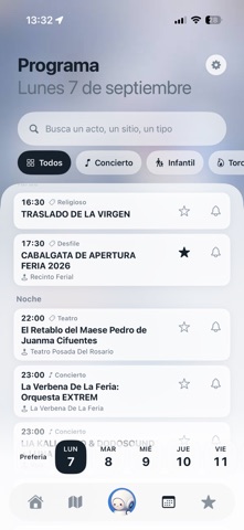
Screenshot style breakdown
Sampled from 6 of IANOS · Feria Albacete Oficial's App Store screenshots — background, accent and theme, measured by LaunchShots (not something Apple publishes).
#E4E4EC bg
#C8C8CF
#2C2C5C accent
#111111 text
- #2Hoy no tienes nada marcado lun 31 ago, 11:00 - Reparto del programa oficial de la Fe... lu
- #3Elige el que más te tire y te cuento lo demás. Si quieres, te lo organizo en plan “mañana
- #4La Verbena De La Feria: Ww la Orquesta EXTREM 2 La Verbena De La Feria
- #5@ AVDA. ESPAÑA (Punta del parq... 546 m @ Avda. DE LA ESTACIÓN 3 599 m =
- #6< La Verbena De La Feria Miércoles 9 de septiembre 11:30 % Infantil
Captions read from the screenshots (OCR, may contain small errors): 5 headlines, 16.4 words on average (longest 19).
Screenshots




Icon palette
About this app
Pregúntame lo que necesites en la Feria y te contesto al momento. Qué hay esta noche, cuánto le falta a tu bus, dónde está el baño más cercano, dónde dejaste el coche. Once días de programa oficial y el plano en 3D. Gratis, sin cuenta y sin anuncios. Soy IANOS, la compañera perfectica de todo feriante. Esto es lo que hago por ti, hora a hora. ANTES DE SALIR DE CASA «¿Qué hay hoy para los críos?», «¿algo cultural el día 12?», «salimos la cuadrilla el sábado». Te monto el día con cinco o seis paradas puestas por hora, de la mañana a la madrugada, y se te guarda en Mis planes. Lo que te interese lo marcas con la estrella y te aviso 30 minutos antes de que empiece. AL LLEGAR Guardas el sitio donde has aparcado. Si vienes en bus, tocas tu parada en el plano y ves los minutos que faltan para el siguiente, los de verdad, en 26 de las 50 paradas. DENTRO DEL RECINTO «¿Dónde está el baño más …
App details
What you can learn from IANOS · Feria Albacete Oficial
Every shipping app on the App Store has gone through the same decisions you're working through right now: which screenshot goes first, what caption sits over it, which device frame to show, what color the background should be. The 6 screenshots above are IANOS · Feria Albacete Oficial's answers to those questions — they're public, they're real, and they made it through Apple's review.
What the numbers say: IANOS · Feria Albacete Oficial runs a mixed light-and-dark set where the background shifts from screenshot to screenshot (first shot #E4E4EC) — each image has to stand on its own, so the captions carry more of the story. The accent colour we picked up, #2C2C5C, is the one to reuse for badges, arrows and highlighted words if you borrow this look. Hit Use this style to open the editor with these exact colours and drop your own screenshot in.
Notice the first screenshot in particular. It's the one users see in search results and on the product page, and it's where most apps spend their best caption and tightest design. Look at the proportion of background to phone, where the text sits, what one thing the image is trying to communicate.
Want to see how other Travel apps approach the same problem? Browse more Travel apps in the showcase.
Take what works into your own screenshots
Open LaunchShots and design your App Store & Google Play screenshots — pick a device frame, drop captions, ship in minutes. Free, in your browser.
Open the screenshot editor →Apps with a similar look
Closest background + accent colours among the listings we've analysed — useful when you want to see the same palette handled by a different team.