Chart position — tracked daily by LaunchShots
Screenshot style breakdown
Sampled from 6 of 青空文庫's App Store screenshots — background, accent and theme, measured by LaunchShots (not something Apple publishes).
#0C3464 bg
#2E5079
#7494BC accent
#FFFFFF text
Screenshots
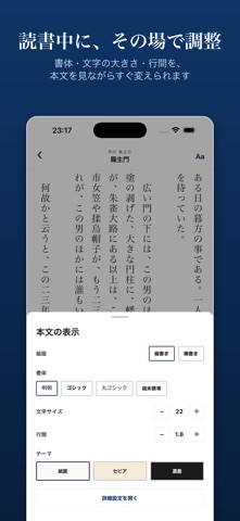


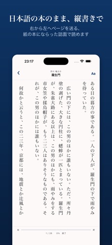


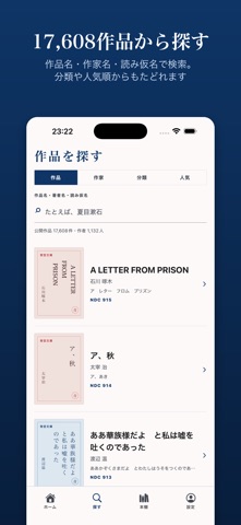
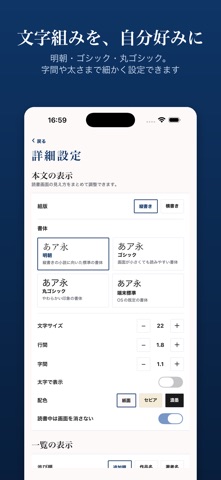
iPad screenshots



Icon palette
About this app
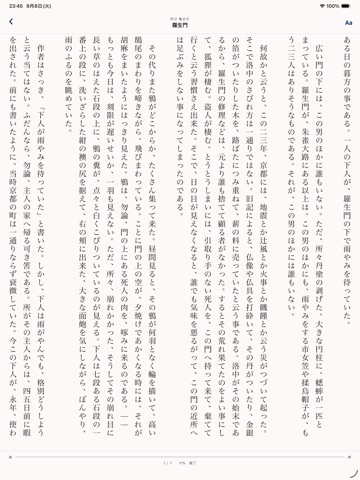
本アプリは、著作権の保護期間が満了した作品を公開している電子図書館「青空文庫」の作品を、iPhone で読むためのアプリです。17,608作品・1,132人の作家の作品を、すべて無料で読めます。 夏目漱石、芥川竜之介、太宰治、宮沢賢治、森鴎外、樋口一葉、坂口安吾、江戸川乱歩、中島敦、小川未明ほか、教科書で読んだあの一編から、名前は知っていても手に取る機会のなかった長編まで。 ■ 登録もログインも不要 アカウント登録は必要ありません。アプリを開いた瞬間から、すべての作品をすべての機能で読めます。読書位置、本棚、表示設定は、この端末の中だけに保存されます。 ■ 日本語の本のままの縦書き 本文は縦書きで表示し、和書と同じく右から左へページを送ります。句読点や小さな「っ」「ゃ」は字面の右上に寄せ、「昭和12年」のような短い数字は縦中横で組みます。紙の本の組版にならった、読んでいて疲れない誌面を目指しました。横書きにも切り替えられます。 ■ 電波のない場所でも読み続けられる 本棚に入れた作品は、本文を端末に保存します。地下鉄…
App details
What you can learn from 青空文庫
Every shipping app on the App Store has gone through the same decisions you're working through right now: which screenshot goes first, what caption sits over it, which device frame to show, what color the background should be. The 12 screenshots above are 青空文庫's answers to those questions — they're public, they're real, and they made it through Apple's review.
What the numbers say: 青空文庫 runs a dark set where the background shifts from screenshot to screenshot (first shot #0C3464) — each image has to stand on its own, so the captions carry more of the story. The accent colour we picked up, #7494BC, is the one to reuse for badges, arrows and highlighted words if you borrow this look. Hit Use this style to open the editor with these exact colours and drop your own screenshot in.
Notice the first screenshot in particular. It's the one users see in search results and on the product page, and it's where most apps spend their best caption and tightest design. Look at the proportion of background to phone, where the text sits, what one thing the image is trying to communicate.
Want to see how other Book apps approach the same problem? Browse more Book apps in the showcase.
Take what works into your own screenshots
Open LaunchShots and design your App Store & Google Play screenshots — pick a device frame, drop captions, ship in minutes. Free, in your browser.
Open the screenshot editor →Apps with a similar look
Closest background + accent colours among the listings we've analysed — useful when you want to see the same palette handled by a different team.