Chart position — tracked daily by LaunchShots
Screenshot style breakdown
Sampled from 6 of ビデオ通話で見せ合いショット! シロップ's App Store screenshots — background, accent and theme, measured by LaunchShots (not something Apple publishes).
#2CACFC bg
#2697DD
#FCF484 accent
#111111 text
Screenshots


Icon palette
About this app
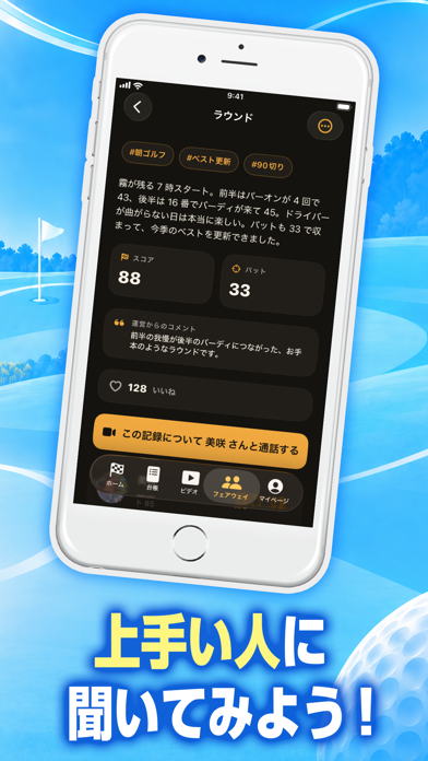
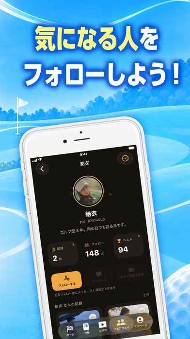
ビデオ通話でスイングを見せ合おう! シロップは、ラウンドのスコアから練習、クラブまでをまとめて残せるゴルフの記録アプリです。ラウンドを予約すると、ホームが当日までの日数をカウントダウン。回り終えたら1ホールずつスコアを入力して振り返り、課題を登録できます。課題は「克服した」と記録するまで練習とつながり続けるので、次のラウンドまでに何を練習すればいいかが見えてきます。 自分の記録を軸に、フォローし合ったゴルフ仲間と記録を共有したり、ビデオ通話でスイングを見せ合ったりもできます。 ▼ 次のラウンドまでをカウントダウン 次のラウンドは、ホームのいちばん上にカウントダウンで表示。すぐ下の持ち物チェックリストで、ボール・グローブ・ティー・雨具の準備を出発前に確認できます。当日は1ホールずつ、打数とパット数を親指で押しやすい大きなボタンで入力。ティーショットで使ったクラブも記録できます。ラウンドは「予約」「準備中」「実施済み」「振り返り済み」の4段階で進みます。 ▼ ラウンド・練習・クラブ・課題をまとめて振…
App details
What you can learn from ビデオ通話で見せ合いショット! シロップ
Every shipping app on the App Store has gone through the same decisions you're working through right now: which screenshot goes first, what caption sits over it, which device frame to show, what color the background should be. The 6 screenshots above are ビデオ通話で見せ合いショット! シロップ's answers to those questions — they're public, they're real, and they made it through Apple's review.
What the numbers say: ビデオ通話で見せ合いショット! シロップ runs a light set where the background shifts from screenshot to screenshot (first shot #2CACFC) — each image has to stand on its own, so the captions carry more of the story. The accent colour we picked up, #FCF484, is the one to reuse for badges, arrows and highlighted words if you borrow this look. Hit Use this style to open the editor with these exact colours and drop your own screenshot in.
Notice the first screenshot in particular. It's the one users see in search results and on the product page, and it's where most apps spend their best caption and tightest design. Look at the proportion of background to phone, where the text sits, what one thing the image is trying to communicate.
Want to see how other Lifestyle apps approach the same problem? Browse more Lifestyle apps in the showcase.
Take what works into your own screenshots
Open LaunchShots and design your App Store & Google Play screenshots — pick a device frame, drop captions, ship in minutes. Free, in your browser.
Open the screenshot editor →Apps with a similar look
Closest background + accent colours among the listings we've analysed — useful when you want to see the same palette handled by a different team.