Chart position — tracked daily by LaunchShots
Screenshot style breakdown
Sampled from 6 of Inburgerify's App Store screenshots — background, accent and theme, measured by LaunchShots (not something Apple publishes).
#FC7C0C bg
#DD6D0A
#8CCCFC accent
#111111 text
Screenshots
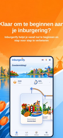


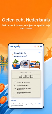
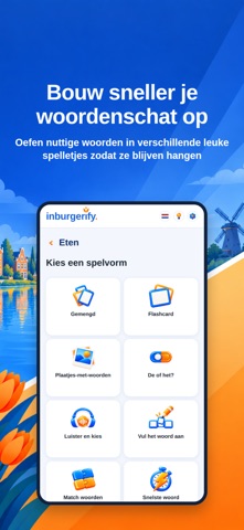
iPad screenshots


Icon palette
About this app
Inburgerify helpt je stap voor stap, van je eerste Nederlandse woorden tot echte gesprekken. Je krijgt korte lessen, duidelijke uitleg en veel oefeningen. Je kunt de app gebruiken in het Nederlands, Engels, Spaans, Oekraïens, Arabisch of Turks. WAT KUN JE DOEN? Leren Duidelijke lessen van A0 tot en met B1. Grammatica wordt eenvoudig uitgelegd, met voorbeelden en oefeningen. Je kunt de uitleg laten voorlezen en alles in je eigen taal bekijken. Oefenen Train lezen, luisteren, schrijven en spreken. Je oefent met leuke opdrachten die je direct kunt toepassen. KNM en KNS Leer over Nederland: werk en inkomen, wonen, gezondheid, onderwijs, geschiedenis en meer. Ook voor het basisexamen in het buitenland oefen je kennis van de Nederlandse samenleving (KNS). Proefexamens Oefen elk onderdeel zoals op het echte examen. Zo wen je aan de vorm van het examen en zie je meteen hoe je het doet. Wo…
App details
What you can learn from Inburgerify
Every shipping app on the App Store has gone through the same decisions you're working through right now: which screenshot goes first, what caption sits over it, which device frame to show, what color the background should be. The 12 screenshots above are Inburgerify's answers to those questions — they're public, they're real, and they made it through Apple's review.
What the numbers say: Inburgerify runs a mixed light-and-dark set where the background shifts from screenshot to screenshot (first shot #FC7C0C) — each image has to stand on its own, so the captions carry more of the story. The accent colour we picked up, #8CCCFC, is the one to reuse for badges, arrows and highlighted words if you borrow this look. Hit Use this style to open the editor with these exact colours and drop your own screenshot in.
Notice the first screenshot in particular. It's the one users see in search results and on the product page, and it's where most apps spend their best caption and tightest design. Look at the proportion of background to phone, where the text sits, what one thing the image is trying to communicate.
Want to see how other Education apps approach the same problem? Browse more Education apps in the showcase.
Take what works into your own screenshots
Open LaunchShots and design your App Store & Google Play screenshots — pick a device frame, drop captions, ship in minutes. Free, in your browser.
Open the screenshot editor →Apps with a similar look
Closest background + accent colours among the listings we've analysed — useful when you want to see the same palette handled by a different team.