Screenshot style breakdown
Sampled from 5 of 携程eBooking's App Store screenshots — background, accent and theme, measured by LaunchShots (not something Apple publishes).
#145CDC bg
#3472E0
#344C74 accent
#FFFFFF text
Screenshots



Icon palette
About this app
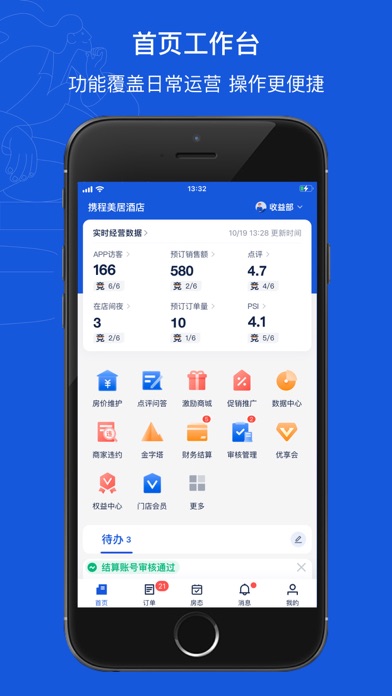
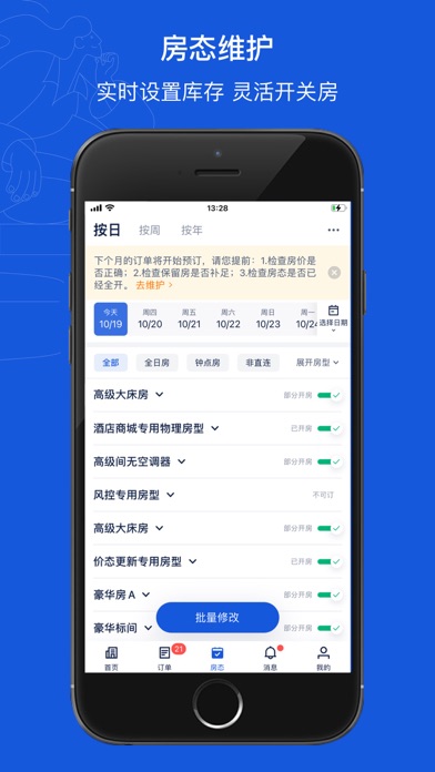
携程酒店 eBooking系统(移动版)是携程于2014年4月22日推出的一个为智能终端提供的移动应用,旨在为酒店提供一种随时随地、方便快捷的酒店后台管理。目前主要移植了订单管理,房态管理等核心功能。 eBooking系统(移动版)支持跨通信运营商、跨操作系统平台通过网络实现酒店常规管理(需消耗少量网络流量) [订单管理] 支持您实时接受、处理和查询订单。 - 具有新订单提醒功能; - 显示当前未处理订单数量; - 手机上可进行接受、拒绝、修改预订号等各类操作; - 查询订单功能,查到店、查订单号更便捷。 [房态管理] 支持您实时管理当前房态和保留房。 - 开关房、限量售卖等设置; - 保留房数量调整; - 每日房型房态展示,掌上房态日历。
App details
What you can learn from 携程eBooking
Every shipping app on the App Store has gone through the same decisions you're working through right now: which screenshot goes first, what caption sits over it, which device frame to show, what color the background should be. The 5 screenshots above are 携程eBooking's answers to those questions — they're public, they're real, and they made it through Apple's review.
What the numbers say: 携程eBooking runs a dark set with one background colour (#145CDC) carried across every screenshot — the listing reads as a single poster when the shots sit side by side in search results. The accent colour we picked up, #344C74, is the one to reuse for badges, arrows and highlighted words if you borrow this look. Hit Use this style to open the editor with these exact colours and drop your own screenshot in.
Notice the first screenshot in particular. It's the one users see in search results and on the product page, and it's where most apps spend their best caption and tightest design. Look at the proportion of background to phone, where the text sits, what one thing the image is trying to communicate.
Want to see how other Travel apps approach the same problem? Browse more Travel apps in the showcase.
Take what works into your own screenshots
Open LaunchShots and design your App Store & Google Play screenshots — pick a device frame, drop captions, ship in minutes. Free, in your browser.
Open the screenshot editor →Apps with a similar look
Closest background + accent colours among the listings we've analysed — useful when you want to see the same palette handled by a different team.