Chart position — tracked daily by LaunchShots
Screenshot style breakdown
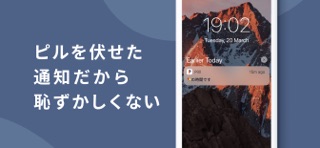
Sampled from 6 of Pilll - ピルの服薬と生理を一緒に管理 ぴるる's App Store screenshots — background, accent and theme, measured by LaunchShots (not something Apple publishes).
#4C6484 bg
#657995
#E4D46C accent
#FFFFFF text
Screenshots
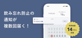

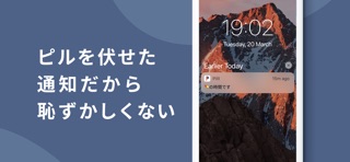


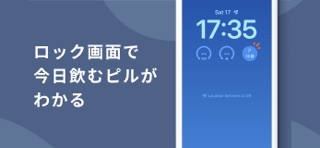

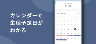
iPad screenshots


Icon palette
About this app
Pilll(ぴるる)は、ピルを飲み忘れないようにあなたをサポートするピルリマインダーです!そして生理も一緒に管理できるアプリです! Pilllは、飲み忘れの不安を安心に変えます。薬の飲み忘れをしっかりサポートします。 ピルと生理を一つのアプリで管理できるから、生理とピルの服用管理がらくらく。 体調記録もできるから、体調や生理に合わせてスケジュールを調整したり、備えたりできます。 「ピルを飲み忘れたかも?!」「今日飲むピルはどれだっけ?」「ピルシートがもうなくなる!」「生理はいつくるかな?!」と感じる不安を安心感に変えます。 ピルを飲んでいる人のための生理管理アプリだから、ピルの飲み忘れを防止しながら、おおよその生理日の把握ができます。 任意のタイミングで休薬できるから、ヤーズフレックスやジェミーナなど連続服用している方も、お使いいただけます。 また、その他のピルを服用中の方も、生理を移動させたい時などにお使いいただけます。 処方されるピルを枚数分登録しておく事で、ピルの在庫管理ができます。 今日飲む…
App details
What you can learn from Pilll - ピルの服薬と生理を一緒に管理 ぴるる
Every shipping app on the App Store has gone through the same decisions you're working through right now: which screenshot goes first, what caption sits over it, which device frame to show, what color the background should be. The 11 screenshots above are Pilll - ピルの服薬と生理を一緒に管理 ぴるる's answers to those questions — they're public, they're real, and they made it through Apple's review.
What the numbers say: Pilll - ピルの服薬と生理を一緒に管理 ぴるる runs a dark set with one background colour (#4C6484) carried across every screenshot — the listing reads as a single poster when the shots sit side by side in search results. The accent colour we picked up, #E4D46C, is the one to reuse for badges, arrows and highlighted words if you borrow this look. Hit Use this style to open the editor with these exact colours and drop your own screenshot in.
Notice the first screenshot in particular. It's the one users see in search results and on the product page, and it's where most apps spend their best caption and tightest design. Look at the proportion of background to phone, where the text sits, what one thing the image is trying to communicate.
Want to see how other Health & Fitness apps approach the same problem? Browse more Health & Fitness apps in the showcase.
Take what works into your own screenshots
Open LaunchShots and design your App Store & Google Play screenshots — pick a device frame, drop captions, ship in minutes. Free, in your browser.
Open the screenshot editor →Apps with a similar look
Closest background + accent colours among the listings we've analysed — useful when you want to see the same palette handled by a different team.