Screenshot style breakdown
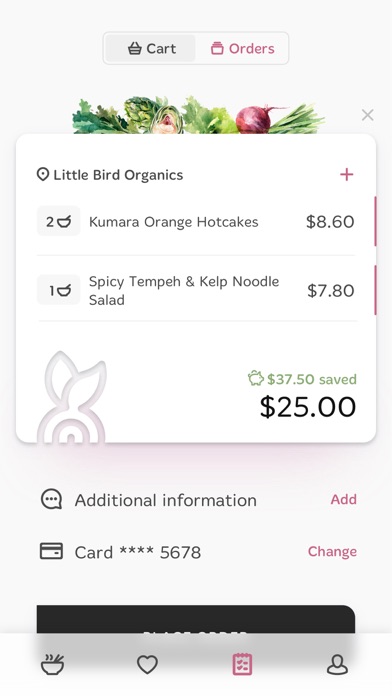
Sampled from 5 of Foodprint's App Store screenshots — background, accent and theme, measured by LaunchShots (not something Apple publishes).
#FCFCFC bg
#DDDDDD
#8C5C2C accent
#111111 text
Reading the caption text from the screenshots in your browser…
Screenshots
Icon palette
About this app
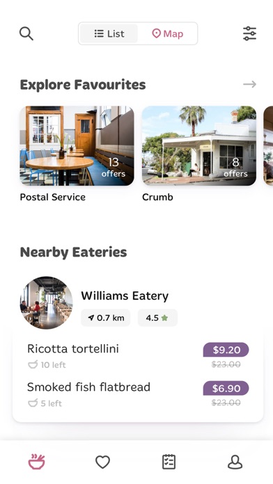
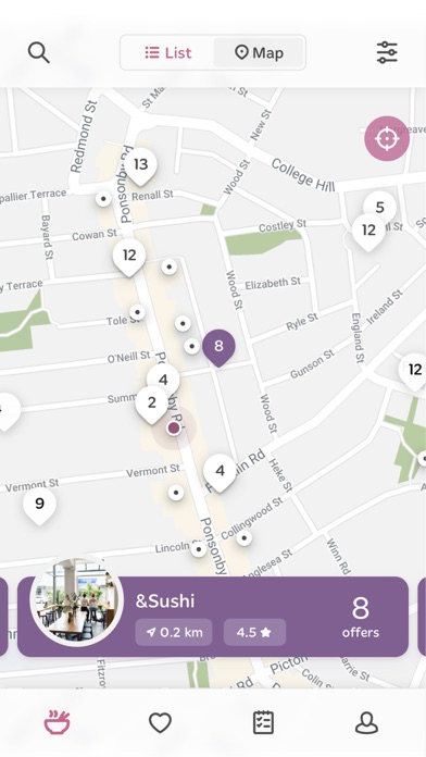
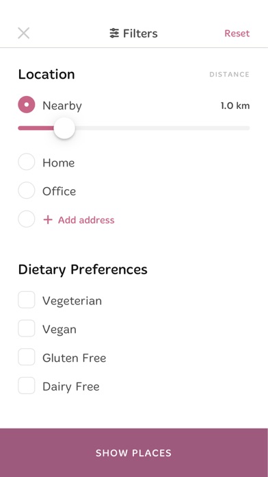
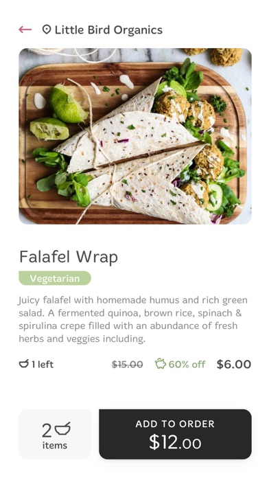
Foodprint connects users to eateries with surplus and imperfect food available for purchase at a discount. Each day the eateries who have partnered with Foodprint upload surplus food items that will otherwise be thrown out. The food is still completely fine to eat and of the same quality as if you’d purchased directly from the store itself. In just a few clicks, you can search for and purchase food items while exploring local eateries and rescuing food from being sent to landfill. In Foodprint you can: - Discover food available using the interactive map or list view - Order and pay for your food - Follow your favourite eateries to receive notifications when they have food available - Filter your search based on your location and dietary requirements - Search specific food items to satisfy your cravings - Leave a review of your experience for the eatery to see - See all previous orde…
App details
What you can learn from Foodprint
Every shipping app on the App Store has gone through the same decisions you're working through right now: which screenshot goes first, what caption sits over it, which device frame to show, what color the background should be. The 5 screenshots above are Foodprint's answers to those questions — they're public, they're real, and they made it through Apple's review.
What the numbers say: Foodprint runs a light set with one background colour (#FCFCFC) carried across every screenshot — the listing reads as a single poster when the shots sit side by side in search results. The accent colour we picked up, #8C5C2C, is the one to reuse for badges, arrows and highlighted words if you borrow this look. Hit Use this style to open the editor with these exact colours and drop your own screenshot in.
Notice the first screenshot in particular. It's the one users see in search results and on the product page, and it's where most apps spend their best caption and tightest design. Look at the proportion of background to phone, where the text sits, what one thing the image is trying to communicate.
Want to see how other Food & Drink apps approach the same problem? Browse more Food & Drink apps in the showcase.
Take what works into your own screenshots
Open LaunchShots and design your App Store & Google Play screenshots — pick a device frame, drop captions, ship in minutes. Free, in your browser.
Open the screenshot editor →Apps with a similar look
Closest background + accent colours among the listings we've analysed — useful when you want to see the same palette handled by a different team.