Chart position — tracked daily by LaunchShots
Screenshot style breakdown
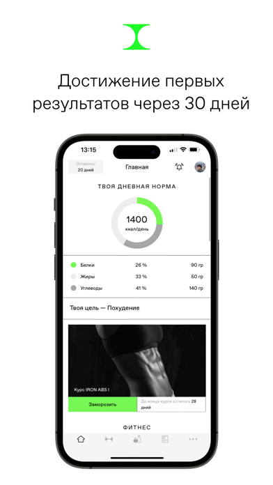
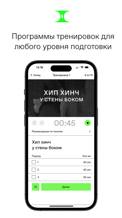
Sampled from 6 of IRNBY's App Store screenshots — background, accent and theme, measured by LaunchShots (not something Apple publishes).
#FCFCFC bg
#DDDDDD
#24FC2C accent
#111111 text
Screenshots



Icon palette
About this app
IRNBY TRAINING CLUB — это уникальное пространство для безопасного совершенствования своего тела и здоровья. Мы создали приложение, которое включает в себя все необходимые аспекты для достижения цели: эффективные тренировочные программы, персонализированные планы питания и психологическую поддержку на протяжении всего пути. Наши тренировки разработаны при участии лучших фитнес-экспертов и составлены с использованием самых современных методик и научного подхода. Каждое упражнение сопровождается видео с подробным объяснением техники выполнения. Ты можешь быть уверена в результативности программ! Планы питания в нашем приложении подбираются пользователя на основе твоих параметров, предпочтений и целей. Ты сможешь выбрать один из трех вариантов: похудение, набор массы или поддержание веса. В каждом плане представлено более 80 уникальных и вкусных рецептов. Каждый прием пищи уже рассчитан…
App details
What you can learn from IRNBY
Every shipping app on the App Store has gone through the same decisions you're working through right now: which screenshot goes first, what caption sits over it, which device frame to show, what color the background should be. The 6 screenshots above are IRNBY's answers to those questions — they're public, they're real, and they made it through Apple's review.
What the numbers say: IRNBY runs a light set with one background colour (#FCFCFC) carried across every screenshot — the listing reads as a single poster when the shots sit side by side in search results. The accent colour we picked up, #24FC2C, is the one to reuse for badges, arrows and highlighted words if you borrow this look. Hit Use this style to open the editor with these exact colours and drop your own screenshot in.
Notice the first screenshot in particular. It's the one users see in search results and on the product page, and it's where most apps spend their best caption and tightest design. Look at the proportion of background to phone, where the text sits, what one thing the image is trying to communicate.
Want to see how other Health & Fitness apps approach the same problem? Browse more Health & Fitness apps in the showcase.
Take what works into your own screenshots
Open LaunchShots and design your App Store & Google Play screenshots — pick a device frame, drop captions, ship in minutes. Free, in your browser.
Open the screenshot editor →Apps with a similar look
Closest background + accent colours among the listings we've analysed — useful when you want to see the same palette handled by a different team.