Chart position — tracked daily by LaunchShots
Screenshot changes — detected by LaunchShots
Screenshot style breakdown
Sampled from 6 of ПРОСТО585 ЛОМБАРД's App Store screenshots — background, accent and theme, measured by LaunchShots (not something Apple publishes).
#FCFCFC bg
#DDDDDD
#DC0C14 accent
#111111 text
- #1Главная Займы онлайн Мои займы
- #2У © e id Главная Займы онлайн Мои займы
- #3Закрыть Главная Займы онлайн Мои займы
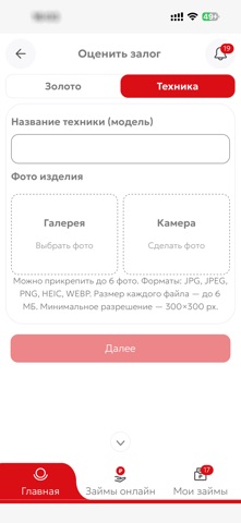
- #4Оценить залог Персональные предложения Каталог золота Каталог техники
- #5Промокод Получить выгодные условия © ©
- #6У Займы онлайн Мои займы
Captions read from the screenshots (OCR, may contain small errors): 6 headlines, 6.5 words on average (longest 9).
Screenshots

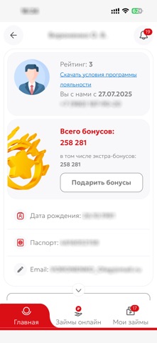
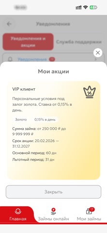
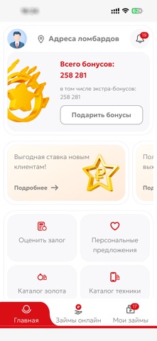
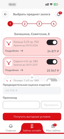
Icon palette
About this app
Мобильное приложение ломбарда ПРОСТО585 — это современный и удобный онлайн сервис, который позволяет быстро получить доступ к вашим залоговым билетам в любое время, в любом месте прямо с телефона. Ломбарды ПРОСТО585 — это федеральная сеть, которая является частью знаменитой ювелирной сети 585GOLD, занимающей лидирующие позиции на рынке уже более 25 лет. Несмотря на сложившиеся традиции ломбарды ПРОСТО585 продолжают развиваться, быть современными, но в тоже время доступными и легкими для любого клиента. В этом году открыто более 150 новых ломбардов. Общее количество ломбардов по всей России — 500 отделений. Более 2 миллионов постоянных клиентов. Наша сеть ломбардов — это сочетание надежности, профессионализма и современных технологий. Мы стремимся сделать услуги максимально удобными, быстрыми и безопасными для каждого. Наши преимущества: - Высокая оценка имущества — золото, техника, бри…
App details
What you can learn from ПРОСТО585 ЛОМБАРД
Every shipping app on the App Store has gone through the same decisions you're working through right now: which screenshot goes first, what caption sits over it, which device frame to show, what color the background should be. The 6 screenshots above are ПРОСТО585 ЛОМБАРД's answers to those questions — they're public, they're real, and they made it through Apple's review.
What the numbers say: ПРОСТО585 ЛОМБАРД runs a light set with one background colour (#FCFCFC) carried across every screenshot — the listing reads as a single poster when the shots sit side by side in search results. The accent colour we picked up, #DC0C14, is the one to reuse for badges, arrows and highlighted words if you borrow this look. Hit Use this style to open the editor with these exact colours and drop your own screenshot in.
Notice the first screenshot in particular. It's the one users see in search results and on the product page, and it's where most apps spend their best caption and tightest design. Look at the proportion of background to phone, where the text sits, what one thing the image is trying to communicate.
Want to see how other Finance apps approach the same problem? Browse more Finance apps in the showcase.
Take what works into your own screenshots
Open LaunchShots and design your App Store & Google Play screenshots — pick a device frame, drop captions, ship in minutes. Free, in your browser.
Open the screenshot editor →Apps with a similar look
Closest background + accent colours among the listings we've analysed — useful when you want to see the same palette handled by a different team.