Chart position — tracked daily by LaunchShots
Screenshot changes — detected by LaunchShots
Screenshot style breakdown
Sampled from 6 of Squadrats's App Store screenshots — background, accent and theme, measured by LaunchShots (not something Apple publishes).
#64349C bg
#7950A9
#04FC7C accent
#FFFFFF text
Screenshots





Icon palette
About this app
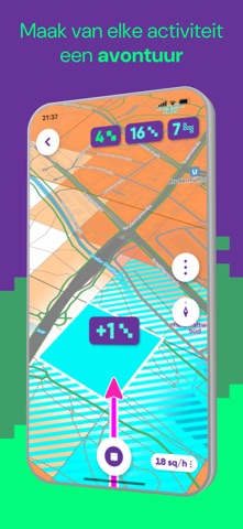
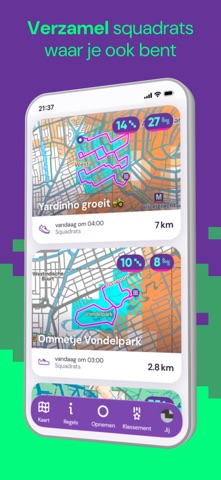
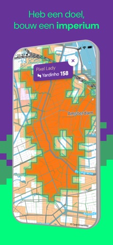
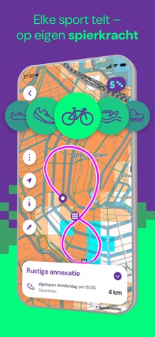
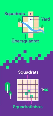
Geef elke fietstocht, hardloopronde, wandeling of andere activiteit een hoger doel. Maak ze spannend door overal waar je komt squadrats te verzamelen. Je hoeft niet meer naar exotische oorden. Met Squadrats ontdek je mysterieuze plekken dicht bij huis. Squadrats zijn vierkante vakjes op de kaart. Jouw missie: verzamel ze. En verbind ze om je eigen rijk op te bouwen. Weinig tijd? Jaag dan op squadratinho's. Ze zijn veel kleiner en veel sneller binnen, maar net zo bevredigend. Hou je van orde, dan ga je het übersquadrat geweldig vinden. Het is een gigantisch squadrat dat je een flinke kick geeft als je er een bouwt. Leuk weetje: 47 van de 100 beste renners in de Tour de France gebruiken Squadrats. Maar je hoeft geen prof te zijn om ervan te genieten. Veel jachtplezier! Terms of Use (EULA): https://www.apple.com/legal/internet-services/itunes/dev/stdevula/
App details
What you can learn from Squadrats
Every shipping app on the App Store has gone through the same decisions you're working through right now: which screenshot goes first, what caption sits over it, which device frame to show, what color the background should be. The 10 screenshots above are Squadrats's answers to those questions — they're public, they're real, and they made it through Apple's review.
What the numbers say: Squadrats runs a mixed light-and-dark set where the background shifts from screenshot to screenshot (first shot #64349C) — each image has to stand on its own, so the captions carry more of the story. The accent colour we picked up, #04FC7C, is the one to reuse for badges, arrows and highlighted words if you borrow this look. Hit Use this style to open the editor with these exact colours and drop your own screenshot in.
Notice the first screenshot in particular. It's the one users see in search results and on the product page, and it's where most apps spend their best caption and tightest design. Look at the proportion of background to phone, where the text sits, what one thing the image is trying to communicate.
Want to see how other Sports apps approach the same problem? Browse more Sports apps in the showcase.
Take what works into your own screenshots
Open LaunchShots and design your App Store & Google Play screenshots — pick a device frame, drop captions, ship in minutes. Free, in your browser.
Open the screenshot editor →Apps with a similar look
Closest background + accent colours among the listings we've analysed — useful when you want to see the same palette handled by a different team.