Chart position — tracked daily by LaunchShots
Screenshot style breakdown
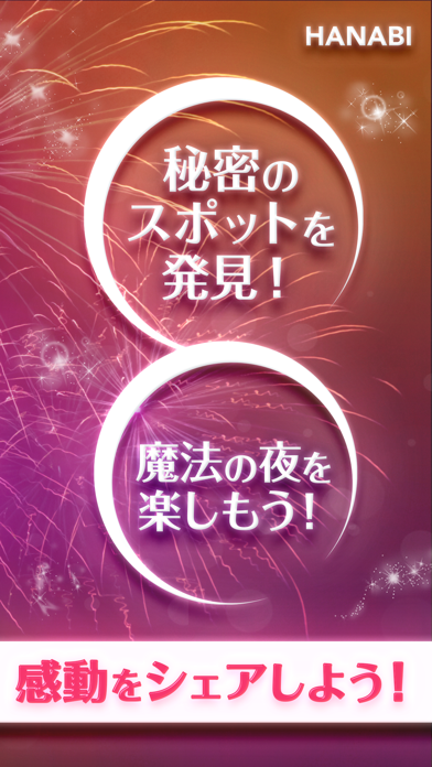
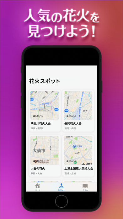
Sampled from 5 of HANABI - ビデオ通話で感動をシェアしよう's App Store screenshots — background, accent and theme, measured by LaunchShots (not something Apple publishes).
#84247C bg
#95428E
#344C6C accent
#FFFFFF text
Screenshots



Icon palette
About this app
ビデオ通話で感動をシェアしよう! HANABIは、隠れた名スポットや絶景ポイントを気軽にシェアできる新しい花火アプリです。 ユーザーは、距離に関係なくリアルタイムで一緒に花火を楽しむことができます。まるで同じ場所で花火を観ているかのような臨場感を味わえます。 【HANABIでできること】 ・自分のお気に入りスポットを投稿、他の人のおすすめスポットをチェック ・花火大会の時間に合わせてビデオ通話を開始、一緒に観賞を楽しむ ・掲示板でイベント情報、撮影スポット、交通アクセスなどをシェア・相談 ・地域別に花火大会の開催日や詳細を検索し、予定を立てる 【こんな人にオススメ!】 ・毎年花火大会に足を運ぶ花火ファン ・穴場の花火スポットを探している人 ・遠くに住んでいる友人や家族と花火を一緒に楽しみたい人 ・花火に関する情報交換ができるコミュニティを探している人 ・最新のイベント情報やゲリラ花火の開催をリアルタイムで知りたい人 HANABIで感動の瞬間を共有。 誰かと一緒に観る花火は、きっと特別な思い出になります。 今すぐダウ…
App details
What you can learn from HANABI - ビデオ通話で感動をシェアしよう
Every shipping app on the App Store has gone through the same decisions you're working through right now: which screenshot goes first, what caption sits over it, which device frame to show, what color the background should be. The 5 screenshots above are HANABI - ビデオ通話で感動をシェアしよう's answers to those questions — they're public, they're real, and they made it through Apple's review.
What the numbers say: HANABI - ビデオ通話で感動をシェアしよう runs a mixed light-and-dark set where the background shifts from screenshot to screenshot (first shot #84247C) — each image has to stand on its own, so the captions carry more of the story. The accent colour we picked up, #344C6C, is the one to reuse for badges, arrows and highlighted words if you borrow this look. Hit Use this style to open the editor with these exact colours and drop your own screenshot in.
Notice the first screenshot in particular. It's the one users see in search results and on the product page, and it's where most apps spend their best caption and tightest design. Look at the proportion of background to phone, where the text sits, what one thing the image is trying to communicate.
Want to see how other Entertainment apps approach the same problem? Browse more Entertainment apps in the showcase.
Take what works into your own screenshots
Open LaunchShots and design your App Store & Google Play screenshots — pick a device frame, drop captions, ship in minutes. Free, in your browser.
Open the screenshot editor →Apps with a similar look
Closest background + accent colours among the listings we've analysed — useful when you want to see the same palette handled by a different team.