Chart position — tracked daily by LaunchShots
Screenshot style breakdown
Sampled from 5 of proxymaker's App Store screenshots — background, accent and theme, measured by LaunchShots (not something Apple publishes).
#1C9CFC bg
#3BA9FC
#648CAC accent
#FFFFFF text
Screenshots



Icon palette
About this app
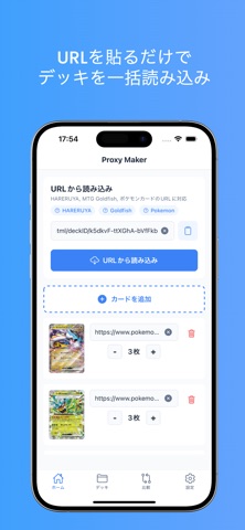
【Proxy Makerとは】 MTG(マジック:ザ・ギャザリング)やポケモンカードのプロキシカードを簡単に作成できるアプリです。練習用のデッキを試したいとき、高額カードを購入する前に使用感を確認したいとき、友人とカジュアルに遊びたいときに最適です。 【主な機能】 ■ カード追加 ・画像URLを入力してカードを追加 ・枚数を自由に設定可能 ・ペーストボタンで素早く入力 ■ デッキリスト自動読み込み ・対応サイトからデッキリストを自動取得 ・URLを貼り付けるだけで一括読み込み ・手動入力の手間を大幅削減 ■ PDF生成・印刷 ・A4サイズで1ページに9枚配置(3×3) ・実際のカードサイズを再現 ・コンビニのマルチコピー機で簡単印刷 ・カラー印刷1ページ50円程度で経済的 ■ デッキ管理 ・複数のデッキを保存・管理 ・デッキにメモを追加可能 ・いつでも編集・削除可能 ■ デッキ比較 ・2つのデッキを並べて比較 ・追加・削除・枚数変更を一目で確認 ・デッキ調整に便利 ■ QRコード共有 ・デッキをQRコー…
App details
What you can learn from proxymaker
Every shipping app on the App Store has gone through the same decisions you're working through right now: which screenshot goes first, what caption sits over it, which device frame to show, what color the background should be. The 5 screenshots above are proxymaker's answers to those questions — they're public, they're real, and they made it through Apple's review.
What the numbers say: proxymaker runs a mixed light-and-dark set where the background shifts from screenshot to screenshot (first shot #1C9CFC) — each image has to stand on its own, so the captions carry more of the story. The accent colour we picked up, #648CAC, is the one to reuse for badges, arrows and highlighted words if you borrow this look. Hit Use this style to open the editor with these exact colours and drop your own screenshot in.
Notice the first screenshot in particular. It's the one users see in search results and on the product page, and it's where most apps spend their best caption and tightest design. Look at the proportion of background to phone, where the text sits, what one thing the image is trying to communicate.
Want to see how other Developer Tools apps approach the same problem? Browse more Developer Tools apps in the showcase.
Take what works into your own screenshots
Open LaunchShots and design your App Store & Google Play screenshots — pick a device frame, drop captions, ship in minutes. Free, in your browser.
Open the screenshot editor →Apps with a similar look
Closest background + accent colours among the listings we've analysed — useful when you want to see the same palette handled by a different team.