Screenshot style breakdown
Sampled from 6 of Tay TV's App Store screenshots — background, accent and theme, measured by LaunchShots (not something Apple publishes).
#0C1C54 bg
#2E3B6B
#0C4CA4 accent
#FFFFFF text
Reading the caption text from the screenshots in your browser…
Screenshots




iPad screenshots

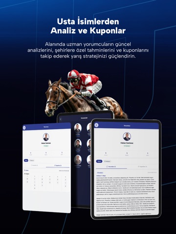
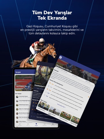

Icon palette
About this app
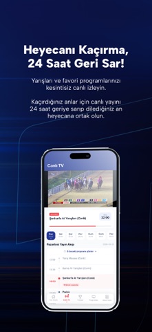
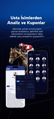
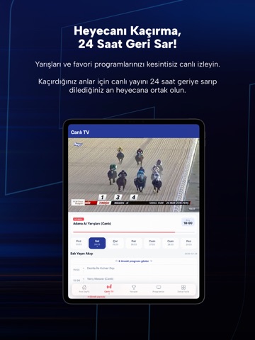
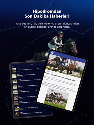
Tay TV, Türkiye'nin ilk ve tek at yarışına özel televizyon kanalının resmi mobil uygulamasıdır. Canlı yarış yayınlarını, güncel haberleri, yarış sonuçlarını ve özel programları dilediğiniz her yerden takip edebilirsiniz. ÖNE ÇIKAN ÖZELLİKLER: • Canlı Yayın ve Geri Sarma: İstanbul, Ankara, İzmir, Adana, Antalya, Şanlıurfa ve diğer hipodromlardan canlı at yarışı yayınları cebinizde. Üstelik kaçırdığınız anlar için canlı yayını 24 saat geriye sararak izleme imkanı! • Yarış Sonuçları: Tüm koşuların sonuçlarına anında ulaşın. • Yarış Programı: Günlük yarış programını ve koşu detaylarını inceleyin. • Haberler: At yarışı dünyasından son dakika haberleri, koşu analizleri ve özel röportajlar. • Programlar: Son Düzlük, Gündem Yetiştiricilik, Beyaz Bayrak Ayna gibi özel yapımları izleyin. • Belgeseller: Yarış dünyasının perde arkasını keşfedin. • Yayın Akışı: Günlük ve haftalık yayın akışını taki…
App details
What you can learn from Tay TV
Every shipping app on the App Store has gone through the same decisions you're working through right now: which screenshot goes first, what caption sits over it, which device frame to show, what color the background should be. The 12 screenshots above are Tay TV's answers to those questions — they're public, they're real, and they made it through Apple's review.
What the numbers say: Tay TV runs a dark set where the background shifts from screenshot to screenshot (first shot #0C1C54) — each image has to stand on its own, so the captions carry more of the story. The accent colour we picked up, #0C4CA4, is the one to reuse for badges, arrows and highlighted words if you borrow this look. Hit Use this style to open the editor with these exact colours and drop your own screenshot in.
Notice the first screenshot in particular. It's the one users see in search results and on the product page, and it's where most apps spend their best caption and tightest design. Look at the proportion of background to phone, where the text sits, what one thing the image is trying to communicate.
Want to see how other Sports apps approach the same problem? Browse more Sports apps in the showcase.
Take what works into your own screenshots
Open LaunchShots and design your App Store & Google Play screenshots — pick a device frame, drop captions, ship in minutes. Free, in your browser.
Open the screenshot editor →Apps with a similar look
Closest background + accent colours among the listings we've analysed — useful when you want to see the same palette handled by a different team.