Chart position — tracked daily by LaunchShots
Screenshot style breakdown
Sampled from 6 of GantComplete's App Store screenshots — background, accent and theme, measured by LaunchShots (not something Apple publishes).
#FCF4F4 bg
#DDD6D6
#5C7CB4 accent
#111111 text
Reading the caption text from the screenshots in your browser…
Screenshots
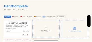
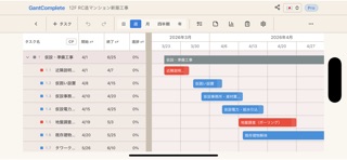
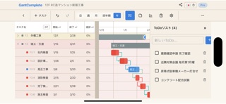
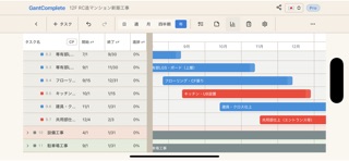

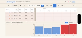

iPad screenshots


Icon palette
About this app
GantComplete は「現場で使える」ことだけを考えて作ったガントチャートアプリです。 横持ち前提の画面設計 工程表は横に長いものです。無理に縦画面へ押し込まず、横持ちで工期の全体像をそのまま表示します。バーは指でつかんで動かせ、日程の変更がその場で終わります。先行するタスクを動かせば、依存している後続の工程も自動でずれていきます。 圏外でも止まらない 地下、山間部、建設現場。電波がなくても工程表を開いて編集できます。通信が戻った時点で自動的に同期されるので、現場で入力し直す手間がありません。 日報が工程表とつながっている その日に動いているタスクが自動で並びます。天候はアイコンを選ぶだけ、進捗はスライダーを動かすだけ。記録した進捗はそのまま工程表に反映されるので、日報と工程表に二重で入力する必要がありません。 指示書の証跡が残る 誰がいつ誰に指示し、相手がいつ受領したかを記録します。未受領の指示は一覧で赤く表示されるので、伝わっていない指示が埋もれません。 報告書をその場で出力 期間を指定す…
App details
What you can learn from GantComplete
Every shipping app on the App Store has gone through the same decisions you're working through right now: which screenshot goes first, what caption sits over it, which device frame to show, what color the background should be. The 11 screenshots above are GantComplete's answers to those questions — they're public, they're real, and they made it through Apple's review.
What the numbers say: GantComplete runs a light set with one background colour (#FCF4F4) carried across every screenshot — the listing reads as a single poster when the shots sit side by side in search results. The accent colour we picked up, #5C7CB4, is the one to reuse for badges, arrows and highlighted words if you borrow this look. Hit Use this style to open the editor with these exact colours and drop your own screenshot in.
Notice the first screenshot in particular. It's the one users see in search results and on the product page, and it's where most apps spend their best caption and tightest design. Look at the proportion of background to phone, where the text sits, what one thing the image is trying to communicate.
Want to see how other Developer Tools apps approach the same problem? Browse more Developer Tools apps in the showcase.
Take what works into your own screenshots
Open LaunchShots and design your App Store & Google Play screenshots — pick a device frame, drop captions, ship in minutes. Free, in your browser.
Open the screenshot editor →Apps with a similar look
Closest background + accent colours among the listings we've analysed — useful when you want to see the same palette handled by a different team.