Chart position — tracked daily by LaunchShots
Screenshot style breakdown
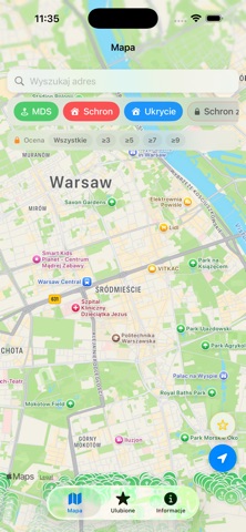
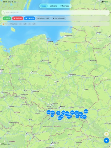
Sampled from 2 of Schrony - OLiOC's App Store screenshots — background, accent and theme, measured by LaunchShots (not something Apple publishes).
#BCBCB4 bg
#A5A59E
#048CFC accent
#111111 text
Screenshots

iPad screenshots

Icon palette
About this app
Schrony OLiOC to przejrzysta mapa miejsc schronienia w Polsce, oparta na publicznych danych o budowlach ochronnych. Aplikacja pokazuje na mapie: • Miejsca Doraźnego Schronienia (MDS) • Miejskie schrony i ukrycia • Schrony i ukrycia zakładowe (funkcja premium) Mapa offline całej Polski: • Podkład OpenStreetMap pobierasz raz (ok. 1 GB) i korzystasz z mapy bez zasięgu • Pobieranie działa w tle, także po zamknięciu aplikacji • W zakładce Informacje przełączysz mapę między wersją offline a Apple Maps • Mapa offline wchodzi w skład zakupu odblokowującego filtr ocen Najważniejsze funkcje: • Kolorowe pinezki z podziałem na typ obiektu • Szybkie filtrowanie według typu schronienia • Filtrowanie według oceny od 1 do 10 (funkcja wspierająca autora) • Wyszukiwanie po adresie i podgląd okolicy (Look Around) • Ostatnio wyszukiwane adresy pod ręką • Ulubione obiekty zapisywane na urządzeniu • Nawig…
App details
What you can learn from Schrony - OLiOC
Every shipping app on the App Store has gone through the same decisions you're working through right now: which screenshot goes first, what caption sits over it, which device frame to show, what color the background should be. The 4 screenshots above are Schrony - OLiOC's answers to those questions — they're public, they're real, and they made it through Apple's review.
What the numbers say: Schrony - OLiOC runs a light set where the background shifts from screenshot to screenshot (first shot #BCBCB4) — each image has to stand on its own, so the captions carry more of the story. The accent colour we picked up, #048CFC, is the one to reuse for badges, arrows and highlighted words if you borrow this look. Hit Use this style to open the editor with these exact colours and drop your own screenshot in.
Notice the first screenshot in particular. It's the one users see in search results and on the product page, and it's where most apps spend their best caption and tightest design. Look at the proportion of background to phone, where the text sits, what one thing the image is trying to communicate.
Want to see how other Navigation apps approach the same problem? Browse more Navigation apps in the showcase.
Take what works into your own screenshots
Open LaunchShots and design your App Store & Google Play screenshots — pick a device frame, drop captions, ship in minutes. Free, in your browser.
Open the screenshot editor →Apps with a similar look
Closest background + accent colours among the listings we've analysed — useful when you want to see the same palette handled by a different team.