Screenshot style breakdown
Sampled from 4 of Ekness: payday plan's App Store screenshots — background, accent and theme, measured by LaunchShots (not something Apple publishes).
#040404 bg
#272727
#CC844C accent
#FFFFFF text
Screenshots
Icon palette
About this app
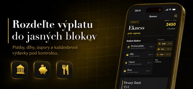
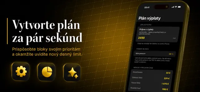
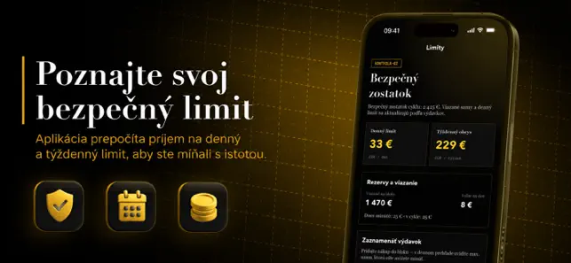
Keď príde mzda, najťažšie je prvé obdobie, kde sa peniaze rozdelia medzi nutné platby, nákupy a náhodné túžby ešte skôr, než sa stihne pokojne zorganizovať týždenný rytmus. Klasický notes či tabuľka ukážu iba záznamy, ale neprevedú príjem na jasný denný limit a nechávajú vás často hádať, koľko je ešte bezpečné minúť. Keď si otvoríte Ekness: payday plan a zadáte príjem — aplikácia ihneď pripraví štruktúru blokov Povinné platby, Dlhy, Úspory, Život, Jedlo, Doprava a Potešenie, aby ste mali pevný bod štartu bez veľkých tabuľkových nastavení. Keď bloky upravíte podľa vlastných priorít — uvidíte novú dennú hranicu, týždenný obrys a ukážku rezervácie v reálnom čase, takže každé rozhodnutie je jednoduchšie a menej stresové. Keď nájdete deň s viacero nákupmi — otvoríte denný prehľad a poznáte presné max. sumy, ktoré môžete minúť bez porušenia plánu. Keď po týždni porovnáte históriu — získate, č…
App details
What you can learn from Ekness: payday plan
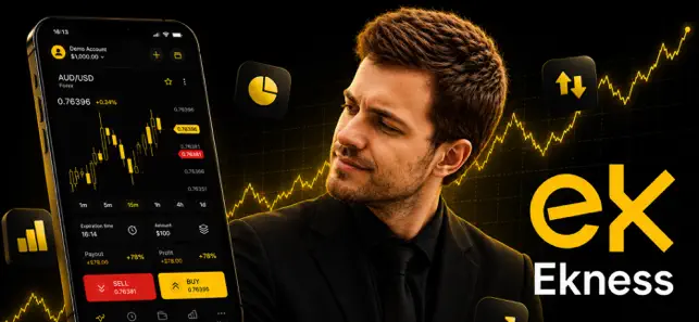
Every shipping app on the App Store has gone through the same decisions you're working through right now: which screenshot goes first, what caption sits over it, which device frame to show, what color the background should be. The 4 screenshots above are Ekness: payday plan's answers to those questions — they're public, they're real, and they made it through Apple's review.
What the numbers say: Ekness: payday plan runs a dark set with one background colour (#040404) carried across every screenshot — the listing reads as a single poster when the shots sit side by side in search results. The accent colour we picked up, #CC844C, is the one to reuse for badges, arrows and highlighted words if you borrow this look. Hit Use this style to open the editor with these exact colours and drop your own screenshot in.
Notice the first screenshot in particular. It's the one users see in search results and on the product page, and it's where most apps spend their best caption and tightest design. Look at the proportion of background to phone, where the text sits, what one thing the image is trying to communicate.
Want to see how other Finance apps approach the same problem? Browse more Finance apps in the showcase.
Take what works into your own screenshots
Open LaunchShots and design your App Store & Google Play screenshots — pick a device frame, drop captions, ship in minutes. Free, in your browser.
Open the screenshot editor →Apps with a similar look
Closest background + accent colours among the listings we've analysed — useful when you want to see the same palette handled by a different team.