Chart position — tracked daily by LaunchShots
Screenshot changes — detected by LaunchShots
Screenshot style breakdown
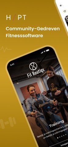
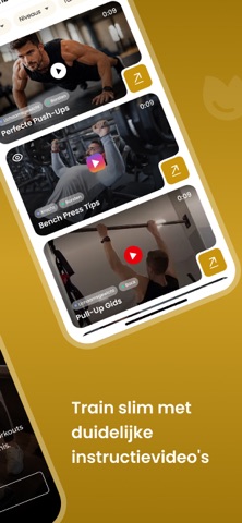
Sampled from 6 of Fit Boutiqs's App Store screenshots — background, accent and theme, measured by LaunchShots (not something Apple publishes).
#A47C0C bg
#B08E2E
#4C2C1C accent
#FFFFFF text
Reading the caption text from the screenshots in your browser…
Screenshots


Icon palette
About this app
Ben je klaar om je gezondheid te verbeteren? Met de Fit Boutiqs app heb je alle tools tot je beschikking om je doelen sneller en efficiënter te bereiken. Wat kun je met de app doen? Volg je voeding: Krijg een duidelijk overzicht van je dagelijkse consumptie en maak bewuste keuzes voor een gezonde levensstijl. Bekijk je trainingsschema's: Volg je trainingen, bekijk je trainingsgeschiedenis en blijf gemotiveerd met gedetailleerde schema's. Boek je favoriete lessen: Gebruik de duidelijke agenda om al je favoriete lessen te bekijken en direct te boeken. Volg je voortgang: Meet je voortgang met regelmatige check-ups, voortgangsfoto's en metingen. Bekijk hoe ver je bent gekomen! Communiceer met je coach: Heb je vragen of opmerkingen? Stel ze eenvoudig via de chatfunctie en krijg direct antwoord van je coach. Met deze app heb je altijd en overal toegang tot de begeleiding die je nodig he…
App details
What you can learn from Fit Boutiqs
Every shipping app on the App Store has gone through the same decisions you're working through right now: which screenshot goes first, what caption sits over it, which device frame to show, what color the background should be. The 8 screenshots above are Fit Boutiqs's answers to those questions — they're public, they're real, and they made it through Apple's review.
What the numbers say: Fit Boutiqs runs a mixed light-and-dark set where the background shifts from screenshot to screenshot (first shot #A47C0C) — each image has to stand on its own, so the captions carry more of the story. The accent colour we picked up, #4C2C1C, is the one to reuse for badges, arrows and highlighted words if you borrow this look. Hit Use this style to open the editor with these exact colours and drop your own screenshot in.
Notice the first screenshot in particular. It's the one users see in search results and on the product page, and it's where most apps spend their best caption and tightest design. Look at the proportion of background to phone, where the text sits, what one thing the image is trying to communicate.
Want to see how other Health & Fitness apps approach the same problem? Browse more Health & Fitness apps in the showcase.
Take what works into your own screenshots
Open LaunchShots and design your App Store & Google Play screenshots — pick a device frame, drop captions, ship in minutes. Free, in your browser.
Open the screenshot editor →Apps with a similar look
Closest background + accent colours among the listings we've analysed — useful when you want to see the same palette handled by a different team.