Chart position — tracked daily by LaunchShots
Screenshot changes — detected by LaunchShots
Screenshot style breakdown
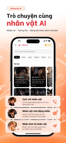
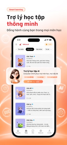
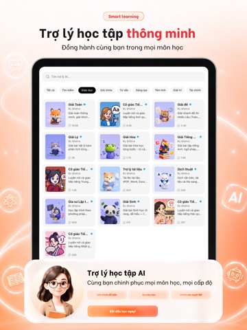
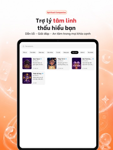
Sampled from 5 of Tatca.ai: Hỏi AI, Tử vi, Tarot's App Store screenshots — background, accent and theme, measured by LaunchShots (not something Apple publishes).
#FCFCFC bg
#DDDDDD
#FCB484 accent
#111111 text
Screenshots



iPad screenshots



Icon palette
About this app
Tatca.ai – Tất cả AI trong một ứng dụng. Trợ lý AI tiếng Việt miễn phí: hỏi đáp, học tập, xem tử vi và tarot, dịch thuật – tất cả trong một app. TRỢ LÝ AI THÔNG MINH – DÙNG MIỄN PHÍ - Chat AI tiếng Việt tự nhiên, hiểu ngữ cảnh, trả lời tức thì - Tìm kiếm web thời gian thực, nghiên cứu chuyên sâu (deep research) - Giải toán, viết lách, lập trình, tóm tắt tài liệu dài - Trò chuyện bằng giọng nói – hỏi đáp rảnh tay - Trải nghiệm quen thuộc như các chatbot AI quốc tế, nhưng tối ưu hoàn toàn cho tiếng Việt TỬ VI – XEM HÀNG NGÀY, LUẬN GIẢI BẰNG AI - Tử vi hàng ngày theo 12 con giáp và 12 cung hoàng đạo - Tử vi 2026: vận trình công danh, tài lộc, tình duyên, sức khoẻ - Luận sao Thái Âm, Thái Dương, Thái Bạch cho từng tuổi - Lá số tử vi trọn đời – AI diễn giải bằng ngôn ngữ dễ hiểu, không cần biết thuật ngữ Hán Việt - Xem tử vi online mọi lúc, hỏi lại AI bất kỳ điều gì chưa rõ TAROT AI –…
App details
What you can learn from Tatca.ai: Hỏi AI, Tử vi, Tarot
Every shipping app on the App Store has gone through the same decisions you're working through right now: which screenshot goes first, what caption sits over it, which device frame to show, what color the background should be. The 10 screenshots above are Tatca.ai: Hỏi AI, Tử vi, Tarot's answers to those questions — they're public, they're real, and they made it through Apple's review.
What the numbers say: Tatca.ai: Hỏi AI, Tử vi, Tarot runs a light set with one background colour (#FCFCFC) carried across every screenshot — the listing reads as a single poster when the shots sit side by side in search results. The accent colour we picked up, #FCB484, is the one to reuse for badges, arrows and highlighted words if you borrow this look. Hit Use this style to open the editor with these exact colours and drop your own screenshot in.
Notice the first screenshot in particular. It's the one users see in search results and on the product page, and it's where most apps spend their best caption and tightest design. Look at the proportion of background to phone, where the text sits, what one thing the image is trying to communicate.
Want to see how other Entertainment apps approach the same problem? Browse more Entertainment apps in the showcase.
Take what works into your own screenshots
Open LaunchShots and design your App Store & Google Play screenshots — pick a device frame, drop captions, ship in minutes. Free, in your browser.
Open the screenshot editor →Apps with a similar look
Closest background + accent colours among the listings we've analysed — useful when you want to see the same palette handled by a different team.