Screenshot style breakdown
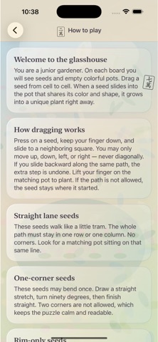
Sampled from 6 of GlsBloomTrails's App Store screenshots — background, accent and theme, measured by LaunchShots (not something Apple publishes).
#E4DCCC bg
#C8C1B3
#84ACD4 accent
#111111 text
Screenshots



Icon palette
About this app
GlassBloom Trails mengubah rumah kaca yang tenang menjadi taman jalur untuk anak-anak. Seret setiap benih melewati kotak-kotak pada papan. Beberapa benih hanya dapat bergerak dalam jalur lurus. Beberapa dapat berbelok satu kali. Sementara yang lainnya harus mengikuti tepian luar rumah kaca. Ketika sebuah benih masuk ke pot yang sesuai dengan warna dan simbolnya, tanaman unik akan langsung muncul. Bilah kemajuan yang ramping menunjukkan jumlah pot yang telah mekar di taman saat ini. Fitur urungkan dan mulai ulang selalu tersedia jika jalur yang dibuat ternyata salah. Di luar taman, tersedia almanak perawatan offline yang menjelaskan kebutuhan penyiraman dan cahaya untuk tanaman asli di dekat jendela. Katalog bunga mengumpulkan tanaman yang telah kamu tanam. Pelatih jalur memungkinkanmu berlatih setiap aturan pergerakan. Catatan berkebun menyimpan pengingat perawatan pribadi hanya di p…
App details
What you can learn from GlsBloomTrails
Every shipping app on the App Store has gone through the same decisions you're working through right now: which screenshot goes first, what caption sits over it, which device frame to show, what color the background should be. The 6 screenshots above are GlsBloomTrails's answers to those questions — they're public, they're real, and they made it through Apple's review.
What the numbers say: GlsBloomTrails runs a light set with one background colour (#E4DCCC) carried across every screenshot — the listing reads as a single poster when the shots sit side by side in search results. The accent colour we picked up, #84ACD4, is the one to reuse for badges, arrows and highlighted words if you borrow this look. Hit Use this style to open the editor with these exact colours and drop your own screenshot in.
Notice the first screenshot in particular. It's the one users see in search results and on the product page, and it's where most apps spend their best caption and tightest design. Look at the proportion of background to phone, where the text sits, what one thing the image is trying to communicate.
Want to see how other Entertainment apps approach the same problem? Browse more Entertainment apps in the showcase.
Take what works into your own screenshots
Open LaunchShots and design your App Store & Google Play screenshots — pick a device frame, drop captions, ship in minutes. Free, in your browser.
Open the screenshot editor →Apps with a similar look
Closest background + accent colours among the listings we've analysed — useful when you want to see the same palette handled by a different team.