Chart position — tracked daily by LaunchShots
Screenshot style breakdown
Sampled from 6 of KAKUNIN MAP's App Store screenshots — background, accent and theme, measured by LaunchShots (not something Apple publishes).
#2C2C2C bg
#494949
#5C84A4 accent
#FFFFFF text
Screenshots




Icon palette
About this app
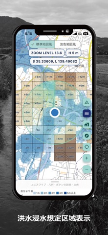
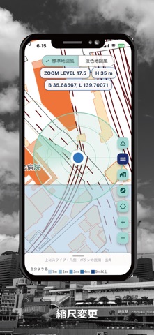
KAKUNIN MAPは、地図の中心地点や現在地の「高低差」を、ひと目で確認できる地形情報アプリです。 【主な機能】 ■ 標高メッシュ表示 地図の中心地点(または現在地)を基準に、周辺の約250mメッシュを、基準より低い場所は青系、高い場所は茶系の色で表示します。各メッシュには、基準との標高差(例:-2m、+5m)が表示されます。 ■ 周辺で最も高い場所を点滅で表示 周辺の中で、基準地点より高い場所のメッシュを点滅させ、高い方向をすばやく確認できます。 ■ 低地エリアの表示 東京湾平均海水面を基準に、標高の低いエリアを確認できます。 ■ 洪水浸水想定区域の表示 国土数値情報の洪水浸水想定区域データ(想定最大規模)を、地図の上に重ねて表示できます。 ■ 指定緊急避難場所・指定避難所の表示と検索 国土地理院が公開している、指定緊急避難場所・指定避難所を、地図上に表示します。現在地の近くにある避難場所を、距離順の一覧で確認することもできます。 ■ 見やすい地図 標準地図風と淡色地図風を、切り替えられます。現在地ボタンやコンパスで、…
App details
What you can learn from KAKUNIN MAP
Every shipping app on the App Store has gone through the same decisions you're working through right now: which screenshot goes first, what caption sits over it, which device frame to show, what color the background should be. The 8 screenshots above are KAKUNIN MAP's answers to those questions — they're public, they're real, and they made it through Apple's review.
What the numbers say: KAKUNIN MAP runs a mixed light-and-dark set where the background shifts from screenshot to screenshot (first shot #2C2C2C) — each image has to stand on its own, so the captions carry more of the story. The accent colour we picked up, #5C84A4, is the one to reuse for badges, arrows and highlighted words if you borrow this look. Hit Use this style to open the editor with these exact colours and drop your own screenshot in.
Notice the first screenshot in particular. It's the one users see in search results and on the product page, and it's where most apps spend their best caption and tightest design. Look at the proportion of background to phone, where the text sits, what one thing the image is trying to communicate.
Want to see how other Navigation apps approach the same problem? Browse more Navigation apps in the showcase.
Take what works into your own screenshots
Open LaunchShots and design your App Store & Google Play screenshots — pick a device frame, drop captions, ship in minutes. Free, in your browser.
Open the screenshot editor →Apps with a similar look
Closest background + accent colours among the listings we've analysed — useful when you want to see the same palette handled by a different team.