Chart position — tracked daily by LaunchShots
Screenshot style breakdown
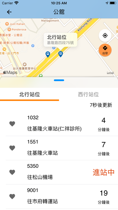
Sampled from 6 of iBus_公路客運's App Store screenshots — background, accent and theme, measured by LaunchShots (not something Apple publishes).
#84BCE4 bg
#74A5C8
#E49444 accent
#111111 text
Screenshots




Icon palette
About this app
iPhone 的使用同好們還在找好用的公車動態資訊程式嗎?由交通部公路總局全新改版的iBus_公路客運動態查詢系統,是您搭乘客運的隨身必備的最佳選擇。 您是否還在煩惱不知道客運何時會到?要搭幾號公車才能到達目的地呢? 【iBus_公路客運】提供你最完整,最即時的客運資訊查詢服務,提供多項貼心的快速查詢功能 新版【iBus_公路客運】程式服務功能資訊如下: 1. 快速查詢介面更活潑簡潔,一手迅速找到查詢之路線 2. 提供臺灣公路客運、國道客運即時動態資訊,更新最即時 3. 我的最愛路線收納功能 4. 提供客運行前規劃功能,依照您目前GPS所在位置提供最佳的搭乘建議. 5. 新增路線詳細資訊圖資,隨時掌握車輛狀況及站牌位置 6. 伺服器系統客運路線資料庫即時更新 7. 依目前GPS所在位置提供附近站牌搭乘建議 ※為提供更優質且簡捷服務,故當更新至2.0版後,原我的最愛及到站提醒等資料因資料格式無法相容,需請您重新設定相關路線及到站提醒,造成您的不諒敬請見諒。 ※需開啓網路及GPS定位功能,系統自動資訊更新頻率為20秒一次 ※為加強資安防護,本局近期封鎖境外IP…
App details
What you can learn from iBus_公路客運
Every shipping app on the App Store has gone through the same decisions you're working through right now: which screenshot goes first, what caption sits over it, which device frame to show, what color the background should be. The 6 screenshots above are iBus_公路客運's answers to those questions — they're public, they're real, and they made it through Apple's review.
What the numbers say: iBus_公路客運 runs a light set where the background shifts from screenshot to screenshot (first shot #84BCE4) — each image has to stand on its own, so the captions carry more of the story. The accent colour we picked up, #E49444, is the one to reuse for badges, arrows and highlighted words if you borrow this look. Hit Use this style to open the editor with these exact colours and drop your own screenshot in.
Notice the first screenshot in particular. It's the one users see in search results and on the product page, and it's where most apps spend their best caption and tightest design. Look at the proportion of background to phone, where the text sits, what one thing the image is trying to communicate.
Want to see how other Navigation apps approach the same problem? Browse more Navigation apps in the showcase.
Take what works into your own screenshots
Open LaunchShots and design your App Store & Google Play screenshots — pick a device frame, drop captions, ship in minutes. Free, in your browser.
Open the screenshot editor →Apps with a similar look
Closest background + accent colours among the listings we've analysed — useful when you want to see the same palette handled by a different team.