Screenshot style breakdown
Sampled from 3 of PA Monitor's App Store screenshots — background, accent and theme, measured by LaunchShots (not something Apple publishes).
#040C1C bg
#272E3B
#2C5C6C accent
#FFFFFF text
Screenshots

Icon palette
About this app
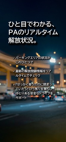
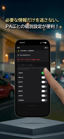
「PA Monitor」は、首都高のパーキングエリア(大黒、辰巳、芝浦など)のリアルタイムな状況をユーザー同士で共有・確認できるアプリです。 【主な機能】 ■ リアルタイム・ステータス 現在「開放中」「閉鎖中」「混雑」などの状況が一目でわかります。 ■ 現場からの投票システム GPSを利用し、実際に現地にいるユーザーからの正確な報告が集まります。 ■ AI予測カレンダー 過去の傾向から、今後の「閉鎖警戒」「混雑」リスクをAIが予測してお知らせします。 ■ リアルタイム・チャット 各PAごとの専用チャットで、現地の様子を写真付きで情報交換できます。 ■ フリートーク テーマを決めて専用のチャットルームを開設。気の合う仲間と深く交流できるプライベート空間です。 ■最新フォト 首都高PAの様子が写真や動画で一目でわかる。 ■全国PA/SAガイド 全国のPA・SAを検索できる。現在地付近の施設検索、ハイウェイ表示、施設・サービス情報に対応。 ■リンク サポート(お問い合わせ) https://docs.google.com/forms/d/e/1FAIpQLSfi-jcesfOkpwlSjv8Zn8yV9hSg5pD…
App details
What you can learn from PA Monitor
Every shipping app on the App Store has gone through the same decisions you're working through right now: which screenshot goes first, what caption sits over it, which device frame to show, what color the background should be. The 3 screenshots above are PA Monitor's answers to those questions — they're public, they're real, and they made it through Apple's review.
What the numbers say: PA Monitor runs a dark set with one background colour (#040C1C) carried across every screenshot — the listing reads as a single poster when the shots sit side by side in search results. The accent colour we picked up, #2C5C6C, is the one to reuse for badges, arrows and highlighted words if you borrow this look. Hit Use this style to open the editor with these exact colours and drop your own screenshot in.
Notice the first screenshot in particular. It's the one users see in search results and on the product page, and it's where most apps spend their best caption and tightest design. Look at the proportion of background to phone, where the text sits, what one thing the image is trying to communicate.
Want to see how other Navigation apps approach the same problem? Browse more Navigation apps in the showcase.
Take what works into your own screenshots
Open LaunchShots and design your App Store & Google Play screenshots — pick a device frame, drop captions, ship in minutes. Free, in your browser.
Open the screenshot editor →Apps with a similar look
Closest background + accent colours among the listings we've analysed — useful when you want to see the same palette handled by a different team.