How to design an app icon that gets noticed
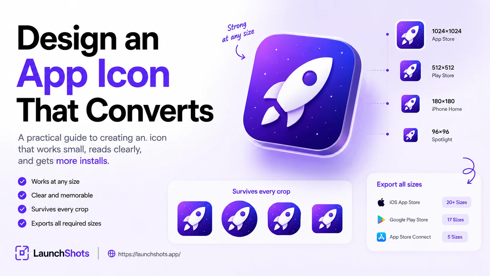
Think about how you browse an app store. You scroll past dozens of results, scanning icons in seconds, tapping the ones that catch your eye and ignoring the rest. Your icon is doing that filtering for you — it's the first thing anyone sees, and it shapes the split-second decision to tap or keep scrolling. Research consistently finds the icon is the single most impactful visual element for App Store conversion, yet most developers rush it at the end and slap on a gradient. This guide is about getting it right.
Why your icon punches above its weight
Your icon shows up almost everywhere: store listings, search results, the home screen, notifications, Spotlight, widgets. It's the most-repeated piece of your brand, often seen before a single word of your description. A strong icon communicates what your app is and earns trust instantly; a weak one quietly costs you installs. Apps that refresh a dated icon to a cleaner design have seen conversion lifts north of 20% — without touching the product itself.
The golden rule: simple scales, complex breaks
The most important principle in icon design is that it has to work small. Apple recommends designing at 1024×1024 but checking readability at 40×40 — because that's roughly how big it is in a crowded search result. If your fine details vanish at that size, they're not details, they're noise.
What this means in practice: one strong symbol beats a detailed scene. A single recognizable shape — a leaf, a camera, a letterform — reads instantly at any size. An intricate illustration with a tiny mascot and a background and three gradients turns to mush at 40px. When in doubt, remove something.
Keep your palette tight
Two to three colors is the sweet spot. A limited palette keeps the icon readable when it's shrunk and makes it more recognizable as a brand mark. Lots of colors look cluttered and get muddier the smaller the icon gets. Pick a dominant color, maybe one accent, and make sure there's strong contrast between your symbol and its background so the shape pops.
Skip the text
As a rule, don't put words in your icon. Letters become unreadable below about 80×80 pixels, which is larger than the icon appears in most contexts. Your app's name already sits right next to the icon in every listing — the icon's job is the visual, not the label. A single letterform as a logo mark is fine; a tagline is not.
Respect the platform differences
iOS and Android don't treat icons the same way:
- iOS leans clean and minimalist — bold shapes, flat color, generous breathing room. The system clips your corners into its signature rounded "superellipse," so keep important elements away from the edges with at least 10% padding. You design one 1024×1024 master and the system generates every smaller size.
- Google Play allows a bit more depth and detail, and uses a 512×512 master. Android applies its own adaptive mask (circle, squircle, etc. depending on the device), so again — keep your key shape centered and away from the edges so no mask crops it awkwardly.
A practical tip: design your symbol to survive both a square and a circular crop. If it still reads when masked into a circle, it'll work everywhere.
Test in context, not in isolation
An icon that looks great at full size in your design tool can disappear on a real home screen. Before you commit:
- Shrink it to 40×40 and 60×60 and check it's still legible.
- Look at it on an actual device, not just the simulator — rendering differs.
- Place it next to competitor icons in your category. Does it stand out or blend in?
- Check it on both light and dark backgrounds, since iOS shows icons on system-tinted surfaces in places like Spotlight and widgets.
When to refresh an existing icon
If your icon looks like it was made five years ago, is hard to read at small sizes, doesn't match your current brand, or simply blends into the crowd, it's worth a redesign. Just be deliberate — a sudden, unrecognizable change can confuse existing users, so evolve the mark rather than replacing it wholesale when you have an established audience.
From design to every required size
Once your concept is solid, you still have to export it in all the sizes both stores demand — iOS alone needs around a dozen distinct sizes across home screen, Spotlight, Settings, and notifications, plus the 512×512 and 1024×1024 store assets. Doing that by hand is tedious and error-prone, and wrong sizes are a real rejection trigger.
That's exactly what our free app icon generator handles: upload your 1024×1024 master and it exports every required iOS and Android size at once, ready to drop into your project — in your browser, no signup, no watermark. Design the one great icon; let the tool produce the rest.
And once your icon is ready, it's only half the listing — your screenshots do the rest of the convincing.
Related posts
Make your App Store screenshots free
LaunchShots is a free, in-browser screenshot maker. No signup, no watermark.
Open the app →
Comments (0)